
Think about your website for a second. It’s your digital storefront, your 24/7 salesperson, your global billboard. Thousands of people might wander through every day, browsing your content or checking out your products. But without a way to start a real conversation, they’re just ghosts passing through.
This is where your lead capture form comes in. It’s not just a box on a page; it’s your first handshake. It’s the moment a passive browser raises their hand and says, “Hey, I’m interested. Let’s talk.”
A well-designed form does so much more than just collect an email address. It greets, it qualifies, and it guides your visitor on their journey. Done right, it becomes the single most important exchange in your entire sales funnel.
Why Your Lead Capture Form Is Your Most Important Handshake
In the old days, forms were just digital clipboards. Fill in the blanks, get an ebook, and land on a massive, impersonal email list. The goal was quantity over quality, and it showed.
Today, that entire mindset is obsolete. The goal isn't just to build a bigger list; it's to start a meaningful conversation with the right people from the very first click. This shift is critical because the lead generation industry is exploding. The global market is set to hit a staggering $295 billion by 2027, and 91% of marketers say lead generation is their number one goal. You can dig into the numbers in this lead generation market analysis.
That kind of growth means competition is fierce. Just having a form isn't enough anymore. Your approach has to be smarter, more conversational, and frankly, more human. Modern tools are built for this new reality. For instance, intelligent platforms like Orbit AI help you turn every form submission into a qualified conversation, making sure you’re talking to people who are actually likely to become customers.
The Shift from Data Collector to Relationship Starter
So, how has the role of a lead capture form really changed? It’s evolved from a simple data entry tool into a strategic, multi-faceted powerhouse.
A great lead capture form does three things exceptionally well: it communicates value instantly, removes as much friction as possible, and seamlessly connects the new lead to the next step in their journey.
This table breaks down the evolution from the traditional approach to a modern, intelligent one.
Core Functions of a Modern Lead Capture Form
This table summarizes the key roles a lead capture form plays in a modern marketing strategy, moving from basic data collection to intelligent lead qualification.
| Function | Traditional Approach | Modern Orbit AI Approach |
|---|---|---|
| Data Collection | Asks for name, email, and phone upfront, creating friction. | Gathers essential data while using progressive profiling to enrich information over time. |
| Lead Qualification | Treats every submission as equal, forcing sales to manually sift through leads. | Uses conditional logic and AI to score and qualify leads in real-time based on their answers. |
| User Experience | A static, one-size-fits-all form that often feels like a chore to complete. | A dynamic, conversational experience that adapts to user input, feeling more like a chat. |
| Automation & Routing | Triggers a generic "thank you" email and adds the lead to a single list. | Automatically routes high-intent leads to sales, schedules demos, and triggers personalized nurture sequences. |
In the modern marketing stack, a form's job is far more sophisticated than just collecting data. It sets the stage for the entire customer relationship.
Here’s a simple way to think about its core functions today:
- Greeting Visitors: A form is often the very first real interaction a potential customer has with your brand. It sets the tone for everything that follows. Make it a good one.
- Qualifying Interest: The questions you ask (and how you ask them) are your first chance to figure out who this person is, what they need, and if you’re a good fit for them.
- Guiding the Journey: A great form submission doesn't end with a "thank you" page. It triggers the next logical step immediately—delivering that promised asset, sending a personalized welcome email, or even offering a link to book a meeting right away.
Ultimately, your lead capture form is the bridge that connects anonymous website traffic to actual, measurable revenue. It's time to stop treating it like a necessary evil and start treating it like the strategic asset it is.
The Anatomy of a High-Converting Lead Capture Form
A high-converting lead capture form is never an accident. It’s a finely tuned machine where every single component has a job, all working together to guide a visitor from casual curiosity to genuine interest with as little friction as possible. Think of it like building a bridge—if even one piece is weak, the whole structure becomes unreliable.
To build a form that people actually want to complete, we need to break it down piece by piece. This isn't about just tossing a few fields on a page; it's about strategic design backed by a solid understanding of user psychology. Let's dissect the essential elements that separate a lead-generating powerhouse from a glorified contact box.
The Irresistible Headline
Your form's headline is its first impression and its most critical promise. It has to answer the user's unspoken question in a fraction of a second: "What's in it for me?" A vague title like "Sign Up" or "Contact Us" is a massive missed opportunity.
Instead, your headline needs to scream value. For example, instead of a boring "Subscribe," a much stronger headline is "Get Our Weekly Growth Hacks." See the difference? It shifts the focus from what the user has to do to what they're going to get.
Strategic Form Fields
The number of fields in your form is a constant balancing act. Every single field you add introduces another decision point for the user, and each one increases the odds they'll just give up. In fact, studies show a staggering 68% of people abandon forms that feel too long or complex. The golden rule here is simple: only ask for what is absolutely essential for the next step.
For a top-of-funnel offer like an ebook, an email address might be all you need. But for a bottom-of-funnel request like a product demo, you'll naturally need more info to qualify the lead, such as their company name and role.
The best forms feel less like an interrogation and more like a conversation. They ask for the minimum information required to deliver value and build trust for future interactions.
Using conditional logic is a game-changer here. The form can dynamically show or hide fields based on a user's previous answers, keeping the experience clean, relevant, and concise. You can learn more about how to build smarter, multi-step forms with Orbit AI that gather rich data without ever overwhelming your users.
Trust Signals and Social Proof
When a visitor lands on your form, they’re subconsciously asking, "Can I really trust this company with my information?" You have to answer that question with clear, visible trust signals. These are the visual cues that reassure people their data is safe and your offer is legitimate.
- Security Badges: Displaying SSL certificates or security logos shows the connection is encrypted and their personal data is protected.
- Privacy Policy Link: A simple link with text like "We respect your privacy" demonstrates transparency and shows you're compliant.
- Testimonials or Logos: Showing logos of well-known clients or a short quote from a happy customer adds powerful social proof and builds instant credibility.
This diagram shows how all these components work in harmony to greet, qualify, and ultimately build a relationship with a potential lead.
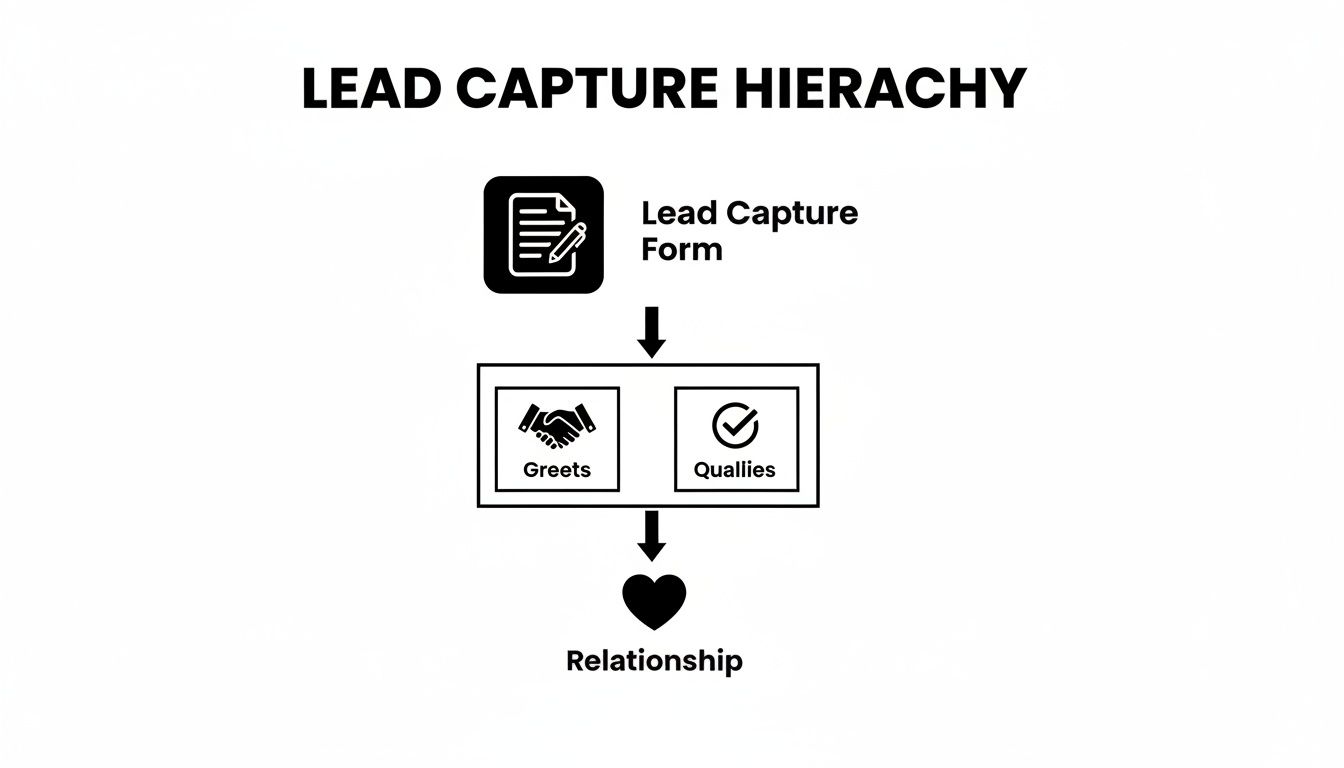
As you can see, the form isn't just a data collection tool. It's the starting point that kicks off the entire qualification process, laying the foundation for a real customer relationship.
A Compelling Call-to-Action Button
Finally, we get to the call-to-action (CTA) button—the finish line. The design and copy of this single element can have a massive impact on whether someone actually clicks it. Generic words like "Submit" or "Send" are functional, but they’re completely uninspiring. They do nothing to motivate the user.
Your CTA should be action-oriented and reinforce the value you promised in the headline.
- "Submit" becomes "Get My Free Guide"
- "Sign Up" becomes "Start My Free Trial"
- "Send" becomes "Reserve My Spot"
Use a contrasting color that makes the button pop off the page, drawing the user's eye and encouraging that final, crucial click. Each of these elements, from the headline down to the CTA, works together to create an experience that feels seamless, trustworthy, and persuasive.
Designing a Frictionless User Experience
Great design isn’t just about looking clean; it’s about understanding how people think. For a lead capture form, that means creating an experience so smooth that users just glide through it without a second thought. This is the heart of a frictionless user experience (UX), and it's the real secret to boosting your form conversions.
The whole point is to minimize cognitive load—that's the mental energy someone has to spend to complete a task. Every single question you ask, every decision you force them to make, and every confusing moment adds a tiny bit of friction. Pile on too much, and your potential lead is gone. The key is to make the entire process feel effortless.
The Great Debate: Multi-Step vs. Single-Page Forms
For years, everyone thought a single-page form was the way to go. Just put everything in one place so the user can get it over with. The problem? This approach often feels like hitting a brick wall—a daunting list of fields that makes people give up before they even start.
A multi-step form, on the other hand, breaks the process down into small, easy-to-handle chunks. Think of it more like a conversation. Instead of demanding everything at once, you start with something simple and non-threatening, like an email address. This gentle start gets the user invested, a psychological trick known as the "foot-in-the-door" technique.
The data backs this up in a big way. Interactive, multi-step forms can generate 2x more conversions than their static, single-page cousins. In fact, research shows a well-designed multi-step form can lift conversion rates by as much as 300% compared to a traditional layout.
Progressive Profiling: The Art of the Smart Ask
The multi-step design opens the door to an even smarter strategy: progressive profiling. This is where you gather information about a lead gradually, over multiple interactions. The first time they visit, your form might just ask for an email to download a guide. The next time they come back for a webinar, the form remembers them and asks for their company name and size.
This method is a game-changer for a few reasons:
- It kills initial friction: You get that first conversion by asking for almost nothing upfront.
- It builds a richer profile: Over time, you build a complete picture of your lead without ever hitting them with a monster form.
- It respects their time: You never ask for the same information twice, creating a much smarter and more personal experience.
By spreading your questions across the entire customer journey, you make each interaction feel light and purposeful. For a deeper dive, check out our guide on how to reduce form friction for even better results.
A Mobile-First Approach Is Non-Negotiable
Let's be clear: designing for mobile isn't an option anymore; it's the starting point. Well over half of all web traffic comes from mobile devices, and a form that’s clunky, slow, or hard to use on a small screen will absolutely destroy your conversion rates.
A mobile-first philosophy means you build your form for the smallest screen first, then adapt it for larger ones.
Think big buttons, readable fonts, and a simple single-column layout that’s easy to navigate with one thumb. Every single element needs to be optimized for a fast, responsive, and seamless experience on a phone.

The design here emphasizes clarity and simplicity. There's plenty of white space and clear visual cues to guide the user without causing distraction, ensuring it looks and works great on any device.
Ultimately, a frictionless experience happens when every element—from the layout to the number of steps to how it works on mobile—is intentionally designed to make the user's life easier. When you embrace these principles, you turn your lead capture form from a necessary evil into an inviting and incredibly effective conversion machine.
How to Measure and Optimize Form Performance
Launching your lead capture form is the starting line, not the finish. The real growth kicks in when you start listening to what your data is telling you. A form isn't a "set it and forget it" tool; it's a living asset that demands constant refinement. By tracking the right metrics, you can transform a decent form into an unbeatable conversion machine.
Think of it like a scientist running an experiment. Your initial form design is the hypothesis. The data you gather from every user interaction will either prove or disprove it, pointing you to exactly where you need to make improvements. This cycle of measuring, testing, and optimizing is what truly separates high-growth teams from everyone else.

Key Metrics You Must Track
To make your form better, you have to know how it’s performing right now. Forget vanity metrics and zero in on the numbers that directly impact your lead generation goals. These are the core KPIs that paint a clear picture of your form's health.
Conversion Rate: This is the big one—the ultimate measure of success. It’s simply the percentage of visitors who saw your form and actually completed it. A low rate is a massive red flag that something is creating friction.
Drop-off Rate: This metric tells you where users are giving up. If you have a multi-step form, you can pinpoint the exact field or question that causes the most people to abandon ship. It’s absolutely invaluable for diagnosing sticking points.
Time to Complete: How long does it take the average person to fill out your form? If it’s dragging on, it could be a sign that your questions are confusing or you're simply asking for too much information at once.
Error Rate: This tracks how often users run into validation errors, like entering an email in the wrong format. If one specific field has a high error rate, it probably means the instructions are unclear or your validation rules are way too strict.
Your goal isn't just to get more submissions; it's to create an experience so smooth that users want to complete it. Every metric is a clue pointing you toward a more frictionless path for your visitors.
Now, let's break down these metrics into a more structured view. Understanding what each one tells you and how to act on it is crucial for systematic improvement.
Key Metrics for Lead Capture Form Optimization
| Metric | What It Measures | How to Improve It |
|---|---|---|
| Conversion Rate | The percentage of visitors who successfully submit the form. The ultimate success metric. | A/B test headlines, simplify form fields, improve CTA button copy and design, enhance visual trust signals. |
| Drop-off Rate | The point in the form where users abandon it. Pinpoints the biggest friction sources. | Remove or rephrase high-friction fields (e.g., phone number), break long forms into multiple steps, improve field labels. |
| Time to Complete | The average time a user takes to fill out and submit the form. | Eliminate non-essential fields, use smart defaults (like auto-detecting country), implement address autocomplete. |
| Error Rate | The frequency of validation errors users encounter on specific fields. | Provide clear inline instructions (e.g., "MM/DD/YYYY"), use helpful error messages, and relax overly strict validation rules. |
Tracking these metrics gives you a roadmap. Instead of guessing what to fix, you can make targeted changes backed by real user data.
The Power of A/B Testing
Once you have your baseline metrics, you can start making things better. The most effective method is A/B testing, where you pit two versions of your form against each other to see which one performs better. The trick is to change only one thing at a time so you can be confident that any change in performance is a direct result of that specific tweak.
For instance, one B2B company tested a detailed lead capture form against a much shorter one. The minimal version converted 47% more leads. Without testing, they would have just been guessing at how much information was too much for their audience.
Here are a few high-impact elements you should absolutely be A/B testing:
- Headline Copy: Test a benefit-driven headline ("Get My Free Ebook") against a direct one ("Download the Ebook").
- Number of Fields: Create a version with fewer required fields to see if it reduces friction and drives more completions.
- Call-to-Action (CTA) Button: Experiment with the button text (e.g., "Start My Free Trial" vs. "Sign Up Now") and its color to see what grabs more attention.
- Form Layout: Compare a single-column layout against a multi-column one, or a single-page form against a multi-step version.
Making data-driven decisions is easy when you have the right tools. Platforms like Orbit AI offer integrated analytics dashboards that make tracking these KPIs a breeze. You can easily see how users are behaving and spot opportunities for improvement without needing a separate analytics tool. For a deeper dive, you can learn more about using form analytics to guide your optimization strategy.
By consistently tracking performance and testing new ideas, your lead capture form will evolve from a static page element into a powerful, self-improving engine for your business's growth.
Integrating Your Form with Your Marketing Tech Stack
Think of a standalone lead capture form like a perfectly written letter with no mailbox. It might be brilliant, but it's not going anywhere. To really get value out of it, your form needs to be the central hub that connects directly to your entire marketing ecosystem. It’s the bridge that lets all that valuable lead data flow seamlessly into the tools that actually run your business.
When you connect your form, you turn a simple submission from a static data point into a dynamic, automated action. Instead of someone having to manually download a CSV file of new emails, a fully integrated form can instantly update your CRM, trigger a personalized welcome email, and ping a sales rep on Slack—all within seconds.
This level of automation isn't just a nice-to-have; it's a competitive necessity. The market for lead capture software is already valued at USD 2.8 billion and is on track to more than double to USD 5.8 billion by 2035. This growth is being driven by businesses that demand tools that don’t just capture leads but also plug directly into their existing marketing channels. You can discover more insights about the lead capture market to see just how central this trend has become.
Why Seamless Integration Is a Non-Negotiable
When your lead capture form is disconnected from everything else, you create a mess of manual work, data silos, and costly delays. A hot lead that has to wait hours—or worse, days—for a follow-up is a lead that has almost certainly gone cold.
Seamless integration solves this by kicking off an intelligent, automated workflow the moment a user clicks "submit."
Here’s what that looks like in the real world:
- Instant Lead Routing: High-intent leads, like someone requesting a product demo, can be instantly fired over to your sales team's CRM with a high-priority tag.
- Automated Nurture Sequences: A new subscriber who downloads an ebook can be automatically dropped into a welcome email series in your marketing automation platform.
- Data Enrichment: The information from the form submission can be used to enrich that contact’s profile in your CRM, giving your sales team a ton of valuable context for their first conversation.
This immediate, automated response system makes sure no lead ever falls through the cracks and that every new contact gets the right message at exactly the right time.
Connecting to Your Core Platforms
A modern lead capture form builder should act like a universal translator, speaking the language of all your essential tools. The goal here is to build a unified system where data flows freely and securely between your platforms, creating a single source of truth for every single lead.
An integrated form transforms a one-time interaction into a continuous, data-rich relationship. It's the starting point for every automated workflow, personalization effort, and sales conversation that follows.
These are the most critical integration categories you need to be thinking about:
Customer Relationship Management (CRM): This is the big one. Sending form data directly to your CRM (like Salesforce, HubSpot, or Pipedrive) gives your sales team a real-time view of new leads, what they're interested in, and their engagement history.
Marketing Automation Platforms: Connecting to tools like Marketo or ActiveCampaign lets you trigger sophisticated nurture campaigns, segment your audience based on what they submitted, and score leads based on their activity.
Email Marketing Services: For simpler workflows, integrating with platforms like Mailchimp or ConvertKit allows you to instantly add new subscribers to the correct email list and kick off welcome sequences.
For example, Orbit AI offers a massive library of native integrations, which means you can connect to dozens of popular tools without having to write a single line of code. This makes creating powerful, end-to-end automated workflows incredibly simple. If you're using HubSpot, for instance, you can check out our guide on integrating your forms in just a few clicks.
Your Actionable Lead Capture Form Checklist
Theory is great, but execution is what gets you results. This checklist boils down everything we've covered into a practical, step-by-step game plan.
Think of this as your pre-flight check before launching. Skipping a step might not seem like a big deal at the moment, but it can be the difference between a smooth takeoff and a form that never gets off the ground.
Phase 1: Pre-Build Strategy
Before you drag and drop a single field, you need a clear plan. Answering these questions first makes sure your form actually serves a purpose and lines up with your bigger business goals.
- Define Your Primary Goal: What's the one thing you absolutely need a user to do? Is it downloading an ebook, booking a demo, or subscribing to a newsletter? Pick one.
- Identify Your Audience: Who are you trying to reach? What's their real motivation for even considering filling out this form?
- Determine Your Value Proposition: What's in it for them, really? Your offer has to be compelling enough to make sharing their personal information feel like a fair trade.
- Map Your Follow-Up Process: What happens the second they click "submit"? Define the automated email they get, how they'll be tagged in your CRM, and who on the sales team gets notified.
Phase 2: Design and Build
With a clear strategy locked in, you can now build a form that's engineered for conversions. This phase is all about creating a frictionless, almost invisible, user experience.
The best forms feel less like an interrogation and more like a helpful conversation. Each element should guide the user effortlessly toward that final click.
- Craft a Benefit-Driven Headline: Don't just label the form. Clearly state what the user will get.
- Select the Absolute Minimum Fields: Start with the bare essentials, like an email address. One study found that cutting form fields from 10 down to just four can boost submissions by a massive 35%.
- Use a Single-Column Layout: It’s just easier for the human eye to scan and is naturally mobile-friendly. No weird side-scrolling required.
- Write a Compelling CTA: Ditch the generic "Submit." Use action-oriented text that reinforces the value, like "Get My Free Guide" or "Book My Demo Slot."
- Add Trust Signals: A simple link to your privacy policy or a security badge can go a long way in reassuring users their data is safe with you.
- Ensure Mobile Responsiveness: Test your form on your phone, your tablet, and any other device you can find. It has to be dead simple to use on a small screen.
Phase 3: Integration and Launch
A form that isn't connected to your other tools is just a data dead-end. Hooking it into your tech stack is what turns a simple submission into a real business process.
- Connect to Your CRM: Make sure new leads automatically pop up in systems like HubSpot or Salesforce without any manual data entry.
- Link to Your Email Platform: Add new subscribers directly to the right list or nurture sequence in tools like Mailchimp or ConvertKit.
- Set Up Notifications: Configure real-time alerts for your sales team via Slack or email, especially for high-intent submissions that need immediate follow-up.
- Test End-to-End: Before you go live, submit a test lead yourself. Make sure the data flows perfectly through the entire system, from form submission to CRM entry to that first automated email.
By methodically working through this checklist, you can confidently build your next high-performing lead capture form. Using a platform like Orbit AI makes this process even smoother, giving you the tools you need to build, integrate, and optimize with confidence.
Answering Your Top Questions About Lead Capture Forms
Even with the best strategy laid out, you’re bound to have some specific questions when you get into the weeds of building a lead capture form. Let's tackle some of the most common ones that come up.
How Many Fields Should a Lead Capture Form Have?
There's no magic number here. The right length is all about a simple trade-off: what you're asking for versus what you're giving in return. The golden rule is to only ask for the absolute minimum you need to deliver on your promise and move the relationship forward.
For something simple like a newsletter sign-up, a single email field is perfect. You're not asking for a big commitment, so your form shouldn't either. But if you're offering a detailed product demo, you'll naturally need more info to qualify the request—think name, company, and job title.
The best practice is to align the form's length with the value of your offer. A comprehensive whitepaper can justify asking for more details than a simple checklist.
This is where tools like Orbit AI really shine. By using conditional logic, you can create a dynamic experience. New fields only pop up based on a user’s previous answers, which lets you gather rich data without making the form feel long or overwhelming from the start.
Where Is the Best Place to Put a Lead Capture Form?
Placement is everything. You want your forms right where visitor intent is highest—don't make potential leads hunt for the chance to connect with you. Think about the user's journey and place the form at a natural next step.
Here are a few high-performing spots to consider:
- Above the fold on your homepage to immediately grab general interest.
- On dedicated landing pages built for specific marketing campaigns or paid ads.
- Within blog posts as a content upgrade, like offering a downloadable ebook related to the article.
- In your website's footer for a persistent, always-on newsletter sign-up.
- As an exit-intent pop-up to catch visitors right before they decide to leave your site.
What Is the Difference Between a Lead Capture Form and a Contact Form?
This is a great question, because while they might look similar, their jobs are completely different. A contact form is a general mailbox, usually parked on a "Contact Us" page. It’s there to handle customer support questions, general feedback, or random inquiries.
A lead capture form, on the other hand, is a precision marketing tool. Its sole purpose is to convert an anonymous visitor into a known lead by offering something valuable in exchange for their information. These forms are always tied directly to a specific marketing campaign and hooked into a CRM to kick off immediate, automated follow-ups.
How Can I Ensure My Forms Are GDPR Compliant?
Making sure your forms comply with regulations like GDPR isn't just a legal checkbox—it's fundamental to building trust. You have to get explicit, un-ticked consent before you send any marketing messages, and you must be crystal clear about why you're collecting their data.
It's also essential to provide an easy-to-find link to your privacy policy and guarantee that any data you collect is stored securely. A platform like Orbit AI makes this much simpler by providing built-in features for consent management and using enterprise-grade encryption to keep all that user data safe and sound.
Ready to turn every form into a qualified conversation? Orbit AI makes it easy to build intelligent, high-converting forms that capture, qualify, and route leads automatically. Start building for free today and see the difference.


