
You've just wrapped up a survey, and now you have a spreadsheet filled with answers, opinions, and checkbox selections. What you're looking at is survey data—the raw information collected directly from your audience.
But it’s so much more than just a collection of facts. Think of it as a direct line to your market. Each response is a snippet of a conversation, giving you the real story behind customer intent, their biggest frustrations, and untapped opportunities for growth.
Turning Raw Survey Data Into Your Growth Engine
Too often, survey data ends up as a static report. It gets presented in a slide deck, filed away, and quickly forgotten. For modern growth teams, though, this information is a living, breathing asset.
It’s less like an academic study and more like a scalable conversation. Every single answer is a puzzle piece that helps you see the bigger picture: the motivations, challenges, and buying signals of your audience. The real work doesn't start when the answers roll in; it begins with a clear strategy to turn those responses into customers.
This guide will walk you through that entire process. We'll start with how to design surveys that people actually want to complete, then move on to the crucial step of cleaning up messy responses, and finally dive into analysis techniques that pull out the gold. The end goal? Weaving these insights directly into your sales and marketing workflows.
From Answers to Actionable Intelligence
The magic happens when survey data moves out of a spreadsheet and into the systems you use every day. This is how you bridge the gap between just collecting information and actually using it to make smarter decisions.
At its core, the process is simple. You ask the right questions, analyze the responses for intent, and then hand off the best opportunities to your sales team.
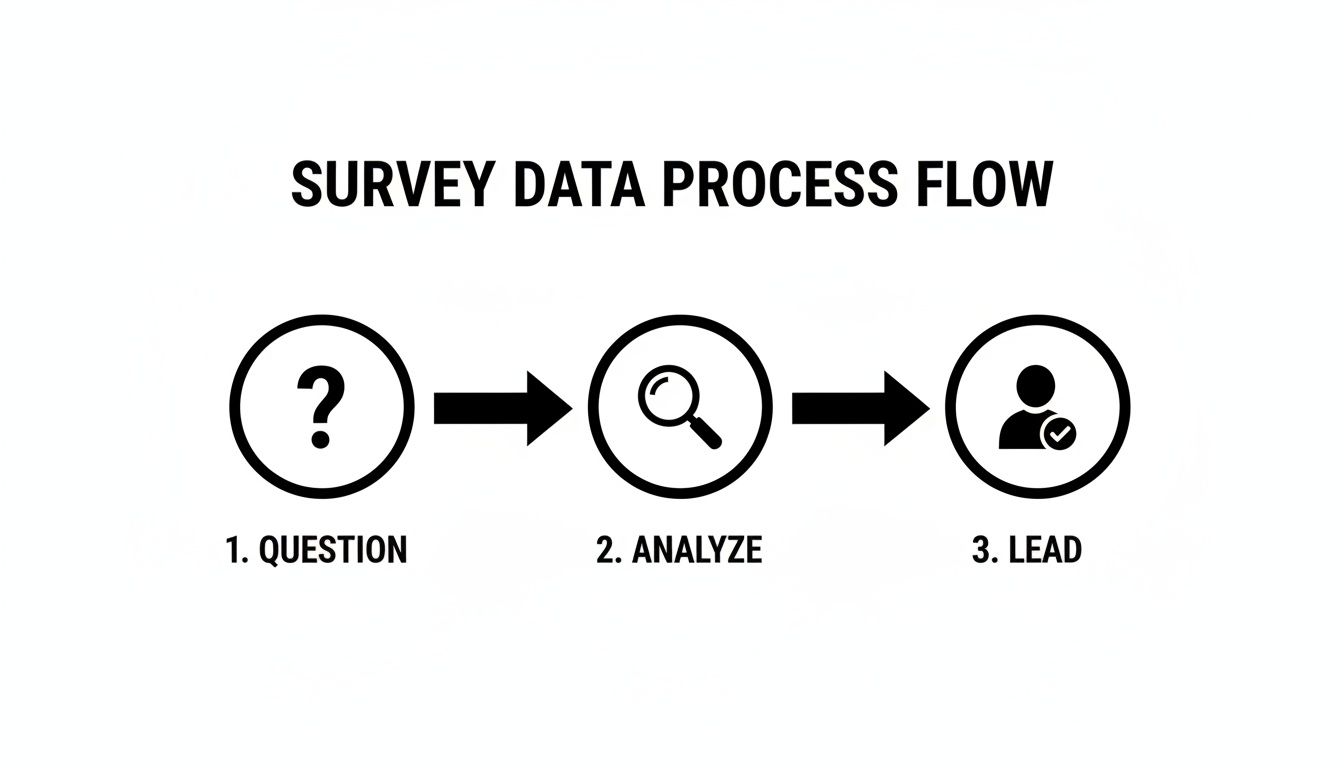
This flow turns a simple Q&A into a powerful lead generation machine.
The Role of Modern Tools
Trying to manually sift through thousands of survey responses to find sales-ready leads is a recipe for missed opportunities and wasted time. This is where modern tools come in. Platforms like Orbit AI are built specifically to connect the dots between the data you collect and the revenue you generate.
By using AI to analyze form submissions in real-time, you can instantly enrich lead data, apply smart scoring, and ensure your sales team always focuses on the most promising opportunities.
This isn't just about saving a few hours. It’s about building a predictable engine for growth. Instead of relying on guesswork, you can create a systematic process that uses the voice of your customer to drive your entire pipeline.
Before you can build this engine, you need a solid foundation. Understanding the different types of data collection is the first step to making sure every survey you launch is set up for success from the very beginning.
To help you visualize this entire workflow, here's a quick look at the journey from a simple survey question to a fully qualified lead in your CRM.
The Survey Data Journey From Question to Qualified Lead
This table provides a high-level overview of the key stages involved in effectively utilizing survey data, highlighting the primary goal of each phase.
| Stage | Primary Goal | Key Challenge | Modern Solution |
|---|---|---|---|
| 1. Collection | Gather high-quality, relevant answers from the right audience. | Low response rates and respondent fatigue. | Engaging, conversational forms with smart logic. |
| 2. Cleaning & Validation | Ensure data is accurate, complete, and free of errors. | Incomplete, inconsistent, or spam submissions. | Automated data validation and real-time error checking. |
| 3. Analysis | Identify patterns, intent signals, and key audience segments. | Finding meaningful insights in large datasets. | AI-powered text analysis and trend identification. |
| 4. Integration | Push insights into CRMs and other business systems. | Manual data entry and siloed information. | Native integrations that sync data automatically. |
| 5. Qualification | Score leads based on their responses and other data points. | Subjective or inconsistent lead scoring. | Automated lead scoring based on predefined criteria. |
| 6. Action | Route qualified leads to the right sales rep instantly. | Slow handoffs that let hot leads go cold. | Real-time notifications and automated CRM routing. |
Ultimately, this journey transforms raw answers into a predictable stream of high-intent leads, ensuring your sales team is always talking to the right people at the right time.
Designing Surveys That Deliver Actionable Data
The quality of the data from survey you collect is decided long before the first person clicks "submit." It all starts with thoughtful design, where every single question, multiple-choice option, and button is intentionally crafted to guide people toward giving you clear, honest answers.
Think of it less like an interrogation and more like a carefully structured conversation.
A poorly designed survey is like asking for directions with a vague, hand-drawn map—you might get an answer, but it probably won’t lead you where you actually need to go. The real goal is to create a frictionless experience that respects your audience's time and encourages them to finish, turning a simple questionnaire into a powerful data collection engine.

This image nails the modern approach to survey creation. Design has to be mobile-first and visually engaging to keep people from bouncing. This user-centric focus is absolutely critical if you want to capture high-quality information you can actually trust to inform your business strategy.
Crafting Questions That Get to the Truth
The foundation of any good survey is its questions. The way you ask something directly shapes the quality of the answer you get back. There are two main types of questions, and they each serve a different, equally important, purpose.
Closed-Ended Questions: These give respondents a predefined set of answers, like multiple-choice, yes/no, or a rating scale. They’re fantastic for collecting quantitative data that’s easy to analyze and benchmark. For example, asking "How satisfied are you with our support?" on a scale of 1 to 5 gives you a clear, measurable metric.
Open-Ended Questions: These invite people to answer in their own words, giving you rich, qualitative context. A question like, "What is one thing we could do to improve our service?" can uncover unexpected pain points and innovative ideas you’d never think to put in a multiple-choice list.
The real art is striking the right balance. Too many open-ended questions will cause survey fatigue and high drop-off rates. But if you have too few, you'll end up with a spreadsheet full of numbers but no story to explain them.
A well-structured survey often uses closed-ended questions to gather the core metrics, then strategically drops in an open-ended question to dig deeper into a specific area you care about.
For teams looking to master this balance, we've put together a comprehensive guide. You can learn more about building effective questionnaires in our deep dive on survey design best practices.
Choosing the Right Channel for Maximum Response
How you send your survey is just as important as what's in it. The channel you pick can dramatically impact your response rates and the type of feedback you receive.
Channel-specific survey response rates reveal some stark contrasts. SMS surveys are absolutely dominating right now with 40-50% response rates, often hitting 45-60% for mobile engagement based on recent benchmarks. That's up to 2-3 times higher than email's modest 15-25%.
Think about it: a quick NPS survey sent via text right after a purchase often nets scores that are 5-8 points higher than the email equivalent because the immediate reply cuts down on negative bias. If a team embeds AI-powered forms in SMS campaigns, they could see 600 completions from 1,200 sends (a 50% rate) versus a measly 180 from 1,200 emails (a 15% rate). For more on this, check out these survey response rate benchmarks.
Personalizing the Experience with Conditional Logic
Static, one-size-fits-all surveys are a relic of the past. Modern survey platforms let you create dynamic, personalized experiences using conditional logic. This just means the survey adapts in real-time based on how a user answered previous questions.
For example, if a user selects "very unsatisfied" with a product, the very next question could automatically be, "We're sorry to hear that. Could you tell us more about what went wrong?" This simple tweak does two things: it shows the user you're actually listening, and it helps you gather much more specific, actionable feedback.
This kind of intelligent routing makes the whole experience more relevant for the user and ensures the data from survey is deeper and more nuanced for your analysis.
3. Cleaning and Validating Your Survey Data
Hitting "export" on your survey responses is just the beginning. The raw data that lands in your spreadsheet is almost never ready for analysis. It’s often a chaotic mix of duplicates, typos, and half-finished thoughts. This is where the real work starts: cleaning and validating that data to turn it from a messy liability into a reliable asset.
Think of it like a chef prepping ingredients. You wouldn't just toss unwashed vegetables and random spices into a pot and hope for a gourmet meal. In the same way, you have to "prep" your survey data—weeding out the duplicates, standardizing the formatting, and dealing with incomplete entries—before you can even think about finding meaningful insights.

If you skip this step, your entire analysis will be built on a shaky foundation. That leads to flawed conclusions, misguided strategies, and a whole lot of wasted effort.
Identifying and Fixing Common Data Issues
Before you can start looking for trends, you need to go on a hunt for the common culprits that can throw off your results. Most data issues fall into a few key categories, and each one needs its own clean-up strategy.
- Incomplete Responses: These are the people who started your survey but bailed halfway through, leaving you with critical gaps in your dataset.
- Duplicate Entries: It happens more than you think. One person might accidentally submit the same survey twice, which can artificially inflate your numbers and skew your findings.
- Inconsistent Formatting: This is a classic problem with open-text fields. One person enters "USA," another types "U.S.A.," and a third writes out "United States." Your analysis software sees these as three totally different answers.
- Nonsensical Answers: These are the gibberish responses you get from bots or people just clicking through to get to the end. Think "asdfghjkl" in the company name field.
To get through this process efficiently, many teams are turning to AI data cleaning tools. These platforms can automate a huge chunk of this tedious work, freeing up your team to focus on the analysis itself, not manual data entry.
The Problem of Nonresponse Bias
One of the biggest silent threats to your survey's integrity is nonresponse bias. This happens when the people who don't answer your survey are fundamentally different from the people who do.
Imagine you survey customers about a new feature, but only your most loyal, engaged fans bother to reply. Your data would paint a picture of overwhelming success, completely masking the frustrations of a silent, unhappy majority. Your decisions would be based on a dangerously incomplete story.
This problem is getting worse as response rates continue to fall. Before the pandemic, the U.S. Bureau of Labor Statistics saw response rates around 60%. During the pandemic, that number cratered to below 45%. A drop like that massively increases the risk of nonresponse bias, leaving you with data that might not represent your whole audience. For B2B teams, this just underscores how crucial it is to use tools that make finishing a survey as frictionless as possible.
Every single valid response is more valuable than ever. The lower your response rate, the more critical it is that the data from survey responses you do collect is clean, accurate, and truly representative.
Proactive Data Validation for Cleaner Inputs
Honestly, the best way to deal with messy data is to stop it from getting into your system in the first place. This is where proactive validation comes in. Modern form builders like Orbit AI let you set up automated rules that clean the data as it’s being entered.
This means you can automatically check that email addresses are in the right format, phone numbers have the correct number of digits, and required fields aren't skipped. You can even use more advanced integrations that spot and block fake or disposable email addresses in real time.
By connecting an automated email verification tool, for instance, you ensure only valid business contacts make it into your CRM. You can learn more about how to keep your email lists clean and effective. This proactive approach saves countless hours of cleanup on the back end and ensures the data you collect is trustworthy from the moment it arrives.
Analyzing Survey Data to Uncover Insights
You’ve got the clean, validated data. Now for the fun part. This is where you stop being a data collector and start being a storyteller. Your job is to transform all those rows and columns into a narrative that explains why your customers behave the way they do, uncovers trends hiding just beneath the surface, and points your team toward smart, strategic decisions.
Think of yourself as a detective. The survey responses are your clues—some are obvious, some are subtle. Your task is to piece them all together, connecting the dots between the numbers and the open-ended comments to build a complete picture of what your audience is really thinking.
Finding Patterns in the Numbers
For the quantitative stuff—your multiple-choice questions, rating scales, and anything with a number attached—the first step is to get a feel for the big picture. This is where descriptive statistics come in, which is just a fancy way of saying you’re summarizing the data to make it understandable.
- Mean (Average): Gives you the central tendency. For example, if the average satisfaction score for your new feature is 4.2 out of 5, you know people generally like it.
- Median (Middle Value): This is the true middle of your data, ignoring those extreme high or low scores that can skew the average. If the median score is 4, it means exactly half of your respondents rated the feature a 4 or lower, and the other half rated it 4 or higher.
- Mode (Most Frequent): This simply tells you which answer was the most popular. If the mode is 5, it means "very satisfied" was the single most common response you received.
These basics give you a solid starting point, but the real magic happens when you start slicing up the data. Segmentation is everything. By filtering your results by demographics (like company size or industry) or past behaviors (like how long they’ve been a customer), you start to uncover the insights that really matter.
You might find that your overall satisfaction score is a healthy 4.2, but when you segment by company size, you discover that small businesses are consistently giving you scores closer to 3.0. That's the kind of actionable insight you were looking for. This deep dive is a crucial part of the broader marketing research stages that separate surface-level reports from game-changing strategy.
Decoding the Story in Text Responses
While numbers tell you what is happening, the open-ended, qualitative responses tell you why. Digging through hundreds of text comments can feel like searching for a needle in a haystack, but a couple of simple techniques can bring clarity to the chaos. If you've included open-ended questions, knowing how to analyze qualitative data is absolutely essential for getting the full story.
Here are two go-to methods:
- Thematic Analysis: This is a hands-on approach where you read through the comments and start grouping them by recurring ideas or themes. You might notice that 30% of negative comments keep mentioning "slow customer support" while another 20% bring up a "confusing interface." By bucketing these comments, you can quantify your qualitative feedback and identify the biggest pain points.
- Sentiment Analysis: This technique is all about categorizing responses as positive, negative, or neutral. It gives you a quick, high-level pulse check on your customers' overall mood. Modern tools can even automate this, instantly flagging comments that express extreme frustration or pure delight so you know where to focus your attention.
AI-powered platforms can now perform both thematic and sentiment analysis in seconds, turning a mountain of unstructured text into a clear, categorized summary of your customers' biggest pain points and happiest moments.
A B2B SaaS Example in Action
Let’s make this real. Imagine a B2B SaaS company runs a survey for users who just finished a free trial. The quantitative data is worrying: 70% of users who completed the trial didn’t convert to a paid plan. That number tells them there’s a problem, but it doesn’t tell them what the problem is.
So, they dive into the open-ended feedback. Using thematic analysis, they quickly spot a dominant theme: "integration challenges." A quick sentiment analysis confirms their suspicion—a whopping 85% of comments that mention integrations are negative.
Suddenly, they have a clear story. Users don't hate the product; they're just getting stuck trying to connect it to their existing tech stack. This single insight is infinitely more valuable than just knowing the conversion rate. It gives the product team a specific, data-backed mission: fix the integration onboarding process. This is how you connect the data from survey directly to business growth.
Visualizing Your Findings for Maximum Impact
You’ve done the hard work. You’ve wrestled with the data, cleaned it up, and run your analysis. But now comes the most critical part: making it all mean something to someone who doesn't have time to dig through a spreadsheet.
This is where so many teams drop the ball. Raw numbers are rarely persuasive on their own. The real magic happens when you turn those numbers into a compelling story, and the best way to do that is with a clear, powerful visual. Effective data visualization isn't about flashy graphics; it's about choosing the right chart to tell the story you've uncovered.

Your goal is to guide stakeholders—from executives to product managers—straight to the core insights without drowning them in detail. You’re not just an analyst anymore; you're a narrator, building a narrative that directly answers the business questions that started this whole process.
Choosing the Right Visual for Your Data
Your choice of chart can make or break your entire presentation. Get it right, and the insight is obvious. Get it wrong, and you can confuse your audience or, worse, lead them to the wrong conclusion.
Think of each chart type as a different tool in your storytelling toolkit. Here’s a quick guide to the essentials:
- Bar Charts: These are your workhorses for comparing different groups. Use them to show which customer segment has the highest satisfaction score or which marketing channel brought in the most survey responses. They make comparisons instantly clear.
- Line Charts: Perfect for showing how things change over time. If you’re tracking your Net Promoter Score (NPS) every quarter, a line chart is the only way to go. It immediately shows you the trend—are things getting better or worse?
- Pie Charts: Use these with extreme caution. They should only be used to show parts of a single whole that adds up to 100%, and they get confusing with more than a few slices. They’re best for simple breakdowns, like showing the percentage of respondents from different company sizes.
- Heat Maps: These are fantastic for making sense of complex data, like the results from a matrix question. They let you see the intersection of two different variables at a glance, highlighting hot spots and cold spots in your data.
Always start with the question you want to answer. Are you comparing values? Showing a trend? Illustrating a distribution? Let the question guide your hand.
Setting Realistic Expectations for Your Results
The quality of your final report is only ever as good as the quality of the data you started with. It's so important to be upfront about this and set realistic expectations based on how you collected the information.
For instance, the results you get from a survey blasted to a cold email list will never compare to the rich insights from a dedicated, pre-recruited panel of participants.
Pew Research Center's American Trends Panel survey achieves an elite 89% survey-level response rate, with a tiny 1% break-off rate. This contrasts sharply with typical enterprise norms of 15-30%. Pew's success stems from its engaged panelists, not cold outreach. Read more about these methodology benchmarks.
For sales and marketing teams, the lesson here is crystal clear: building real, ongoing relationships with your audience will always yield better data from survey results than one-off campaigns. Your reporting needs to be honest about the source and potential biases in your data. It ensures stakeholders interpret your findings correctly, because at the end of the day, your beautiful charts are only as trustworthy as the numbers behind them.
Activating Survey Insights with AI and Automation
Collecting and analyzing survey data is just the starting line. The real magic happens when you turn those static answers into action—specifically, the kind of action that drives revenue. This is where AI and automation come in, building a bridge between knowing something about your audience and doing something about it.
Think about it. Manually digging through form submissions to find the needle-in-a-haystack qualified lead is painfully slow and full of human error. By the time a sales rep finally gets to a promising prospect, that person’s initial excitement has likely faded.
Modern automation flips that entire script. Instead of just passively collecting data, you can build an active qualification engine that works for you 24/7. This isn't just about gathering information; it’s about analyzing, enriching, and acting on it the second it arrives, turning a simple form submission into a sales-ready opportunity.
How an AI SDR Turns Data Into Deals
Imagine having a sales development rep (SDR) who can instantly read and understand every single form submission the moment it comes in. That's exactly what an AI SDR does. These systems are designed to analyze form answers, enrich the contact with crucial data like company size and industry, and apply a smart lead score—all automatically.
This single process cuts out countless hours of manual grunt work and ensures your sales team spends their valuable time only on the leads with the highest chance of converting. It’s a fundamental shift from playing catch-up to engaging proactively. You can get a deeper look into how these systems operate by learning about Orbit AI's AI agents.
By automating lead qualification and routing, teams can respond to high-intent prospects in minutes, not hours. This speed is a significant competitive advantage, as studies show that contacting a lead within the first five minutes increases conversion rates dramatically.
Top AI-Powered Form and Automation Tools
Several tools can help you bring your survey data to life, each with its own unique strengths. The goal is to find a platform that doesn't just capture information but helps you qualify and act on it without missing a beat.
Choosing the right tool depends entirely on your team's specific needs—from simple form building to creating a fully automated sales pipeline.
Here’s a quick comparison of some of the leading solutions on the market today:
| Tool | Key Feature | Best For |
|---|---|---|
| 1. Orbit AI | Integrated AI SDR for real-time lead qualification, scoring, and data enrichment. | Growth-focused B2B teams needing to turn form submissions into a predictable sales pipeline. |
| 2. Jotform | Extensive template library and conditional logic for creating complex forms. | Businesses that need a wide variety of form types for different use cases, from HR to event registration. |
| 3. Typeform | Conversational, one-question-at-a-time user experience. | Marketers focused on maximizing engagement and completion rates through a friendly, interactive interface. |
| 4. HubSpot Forms | Native integration with HubSpot’s CRM and marketing automation suite. | Companies already heavily invested in the HubSpot ecosystem that want to keep all their data in one place. |
| 5. Zapier | Connects thousands of apps to automate workflows between your forms and other tools. | Teams with complex tech stacks that need to create custom integrations without writing code. |
Ultimately, the best platform is the one that closes the gap between data collection and sales action most effectively for your workflow.
A Practical Example in Action
Let's walk through a real-world scenario to see how this works. A prospect lands on your website and fills out your "Request a Demo" form.
- Submission: The prospect answers questions about their company size, primary challenge, and their role.
- AI Analysis: The instant they hit "submit," Orbit AI’s SDR gets to work. It immediately identifies key phrases like "Director of Marketing" at a "500-person tech company" struggling with "lead qualification."
- Enrichment & Scoring: The AI then enriches this profile with publicly available data and assigns a lead score of 95/100 based on your pre-defined ideal customer profile.
- Routing & Sync: Because this is a highly qualified lead, it's automatically routed to the top account executive for that territory. Simultaneously, the complete, enriched profile is synced to your CRM.
This entire process takes just a few seconds. Your sales rep gets a real-time notification with all the context they need, allowing them to engage a hot lead while that person is still active on your site. This is how you transform simple survey data into a powerful, automated growth engine.
A Few Common Questions About Survey Data
Once you start using surveys to do more than just collect feedback, a few practical questions always pop up. How do you move from simply gathering responses to using that data for real growth? Let's tackle some of the most common hurdles teams face.
Think of these as the quick, straightforward answers you need to refine your strategy and start using survey data with confidence.
How Long Is Too Long for a Survey?
Finding the sweet spot for survey length is all about balancing the depth you need with the time your audience is willing to give. For most B2B scenarios, a survey that takes 5-10 minutes to complete is about right. Go much longer, and you'll see a steep drop-off in completion rates.
But context is everything. The "right" length really depends on who you're asking and why. A loyal customer who loves your product might happily spend 15 minutes giving you detailed feedback. On the other hand, a new prospect who just landed on your website will probably bail if a form takes more than 2 minutes.
It’s not just about the number of questions, but the perceived effort. A 10-question survey with dense, open-ended questions can feel way longer than a 20-question survey with simple multiple-choice options.
What's a Good Survey Response Rate, Anyway?
"Good" is a tricky word here because response rates can be all over the map depending on your industry, who you're surveying, and how you send it out. But it's still a useful benchmark to gauge how well your outreach is working.
Here are some general guidelines to keep your expectations realistic:
- Internal Surveys (like employee feedback): You should be aiming for 30-40% or higher. Your audience is captive and already engaged, so participation should be strong.
- External Surveys (like customer feedback): A response rate of 10-15% is often considered a solid win.
- Cold Outreach Surveys: This is tough. Anything over 1% can be a victory, which is why this method isn't great for gathering deep, qualitative insights.
Always remember this: a high response rate from the wrong audience is worth less than a lower rate from your ideal customer. Quality will always beat quantity.
How Should I Handle Missing or Incomplete Data?
It's going to happen. People will skip questions or abandon your survey halfway through. The key is how you deal with those gaps to protect the integrity of your data. First, try to figure out if the missing data is random or if there's a pattern. If tons of people are skipping the same question, it’s a red flag that the question might be confusing, too personal, or just poorly worded.
When it comes to the analysis, you have a few choices. If you have a massive sample size, you can simply exclude the incomplete responses. For quantitative analysis, there are statistical methods to estimate, or impute, the missing values, but that can get complicated. Honestly, the simplest and safest route is often to work only with the fully completed responses to avoid accidentally introducing bias into your results.
Ready to turn your survey data into your most predictable source of qualified leads? With Orbit AI, you can build beautiful, high-converting forms and use a built-in AI SDR to instantly qualify, enrich, and route every submission. Stop letting good leads sit in a spreadsheet and start closing deals faster. Get started for free today at Orbit AI.


