
Staring at your analytics, seeing traffic numbers climb while revenue stays flat, can feel like you're running in place. It's a common frustration, but the fix is surprisingly straightforward: you need to diagnose where users are getting stuck, prioritize the highest-impact fixes, and test your changes until you turn those casual visitors into actual customers.
This is the heart of Conversion Rate Optimization (CRO), and it’s the most direct path to measurable growth.
Why Your Website Traffic Isn't Converting
Getting people to your website is only half the battle. If those visitors don’t take the next step—whether that's buying a product, booking a demo, or signing up for your newsletter—then all that traffic is just a vanity metric. The real work begins when you start asking why they aren't converting. That’s how you unlock the revenue hiding in plain sight.
This guide isn't about generic advice. It's a real-world playbook for improving your website's conversion rates. We'll dig into the hidden roadblocks costing you sales, from confusing navigation and slow page speeds to those clunky forms that kill a user's motivation on the spot.

The Conversion Rate Reality Check
First, let's set some realistic expectations. Across all industries, the average website conversion rate hovers around 2.9%. It’s a sobering number, but it also highlights a massive opportunity, especially since businesses using optimized forms and lead capture tools can blow past that benchmark.
For any growth team, that statistic is a clear signal: your forms aren't just data fields; they are conversion engines waiting to be tuned. You can see how these numbers stack up by checking out more conversion rate statistics by industry.
The disconnect between traffic and conversions almost always boils down to a poor user experience. Your visitors arrive with a goal, and if your website throws up unnecessary hurdles, they will leave without a second thought.
Common Conversion Killers
Your visitors are leaving for specific reasons, not by accident. Once you understand the usual suspects, you can start to diagnose your own site's weaknesses. Most of these issues fall into a few key buckets:
- Lack of Clarity: Your core value proposition is muddy, or your calls-to-action (CTAs) are weak, uninspired, and fail to create any sense of urgency.
- Friction in the Process: Your forms are way too long, your checkout process has a dozen steps, or your navigation is a maze. You can learn more about these common pitfalls by exploring the reasons why visitors abandon online forms.
- Absence of Trust: The site is missing crucial social proof like customer testimonials, lacks security badges, or just looks unprofessional, making visitors feel uneasy about handing over their information.
- Poor Performance: Your website loads at a snail's pace, especially on mobile. This causes people to bounce before they even see what you have to offer.
Finding the Friction: A Data-Driven Diagnostic Approach
Before you can improve your website's conversion rates, you have to become a digital detective. Jumping straight to solutions without a proper diagnosis is like trying to fix a car without looking under the hood—you're just guessing. A data-driven approach removes that guesswork, letting you pinpoint exactly where users are hitting a wall and dropping off.
The goal is to move from "I think the problem is..." to "The data shows the problem is..." This shift is everything in successful conversion rate optimization (CRO). It makes sure your efforts are focused on issues that have a real, measurable impact on your bottom line.

Starting with the Numbers (Quantitative Data)
Your investigation always starts with quantitative data—the "what" and "where" of user behavior. Tools like Google Analytics are your primary source of truth here, providing hard numbers that reveal patterns and flag problem areas at scale.
First, map out your conversion funnel. This is simply the path a visitor takes from their entry point (like a blog post or ad landing page) all the way to the final conversion goal (like a purchase or demo request). A typical B2B SaaS funnel might look something like: Homepage → Pricing Page → Demo Request Form → Thank You Page.
With that funnel mapped, you can analyze the drop-off rate between each step. Let's say you discover that 80% of visitors leave on your pricing page. Boom. You've just found a massive friction point.
A high abandonment rate on your checkout or sign-up form points to another specific, actionable problem. If you see a major leak at this last stage, it’s a good idea to dive deeper into form submission tracking and analytics to understand which specific fields are causing people to give up.
Key Takeaway: Funnel analysis doesn't just show you if you have a problem; it shows you precisely where the leak is. This focus is critical for allocating your resources effectively.
Layering on the "Why" (Qualitative Insights)
While the numbers tell you what is happening, qualitative data tells you why. This is where you put yourself in your users' shoes to understand their experience on a human level.
Tools like heatmaps, scroll maps, and session recordings are absolute gold for this.
- Heatmaps: These show you exactly where users click, move their mouse, and how far they scroll. A heatmap might reveal that users are frantically clicking a non-clickable image, signaling a UX flaw, or that they aren't even scrolling far enough to see your main call-to-action.
- Session Recordings: Think of these as watching a DVR replay of a user's entire visit. You can see their mouse movements, where they hesitate, and where they get stuck. Watching just a handful of recordings of users abandoning your checkout form can reveal more than a spreadsheet ever could.
Imagine watching a session recording and seeing a user try to fill out your contact form on their phone. They struggle to tap the tiny form fields, get frustrated when the keyboard covers the "Next" button, and eventually just leave. That single recording gives you a clear, undeniable reason for your high form abandonment rate on mobile.
Building Your Conversion Diagnostics Toolkit
Combining these different data sources gives you a complete picture of user friction. You need both to form strong, testable hypotheses for what to fix. Here’s a quick rundown of the essential tools for the job.
Your Conversion Diagnostics Toolkit
| Tool Category | What It Measures | Helps Uncover |
|---|---|---|
| Web Analytics (e.g., Google Analytics) | User flow, drop-off rates, traffic sources, bounce rates, and conversion goals. | The specific pages or steps in your funnel where the most users are leaving. |
| Heatmap & Scroll Map Tools (e.g., Hotjar) | Clicks, mouse movement, and scroll depth on a page in aggregate. | What elements users interact with, what they ignore, and if they see key content. |
| Session Recording Tools (e.g., FullStory) | Individual user sessions, including clicks, scrolls, and navigation paths. | The "why" behind user struggles, technical glitches, and confusing UX elements. |
| User Feedback & Surveys (e.g., Qualaroo) | Direct user opinions, objections, and questions collected via on-site polls. | Customer motivations, pain points, and missing information directly from the source. |
This systematic approach—moving from broad quantitative analysis to specific qualitative insights—creates a clear roadmap for improvement. You're no longer just throwing random changes at your website and hoping for the best. Instead, every fix you propose is backed by real evidence, massively increasing your chances of making a positive impact on your conversion rates.
How to Prioritize Fixes for Maximum Impact
After a good, hard look at your analytics and user feedback, you’ll probably have a list of potential fixes as long as your arm. You've found a dozen friction points, from a clunky checkout flow to a call-to-action button that's practically invisible.
The urge to jump in and fix everything at once is strong, but it's a trap. That scattergun approach almost always leads to wasted effort and results you can barely measure. To actually move the needle on your conversion rates, you need to get strategic about where you start.
Instead of guessing, you need a simple framework to tell the game-changers from the minor tweaks. This is where the Impact vs. Effort matrix becomes your best friend. It’s a dead-simple way to sort through the noise, making sure you tackle the most critical issues first and build some real momentum.
The Impact vs. Effort Matrix Explained
This isn't rocket science. The matrix is just a four-quadrant grid. On one axis, you plot Impact—the potential lift a fix could give your conversion rate. On the other, you plot Effort—the time, money, and technical headaches needed to get it done.
By scoring each idea on those two scales, you can slot everything into four buckets:
- Quick Wins (High Impact, Low Effort): This is the low-hanging fruit, the stuff you should do right now. Think about rewriting a confusing headline, changing a CTA button color from grey to something that pops, or simplifying the labels on your contact form. These are cheap, fast, and can deliver surprisingly big results.
- Major Projects (High Impact, High Effort): These are the big, ambitious initiatives. We're talking about a full homepage redesign, overhauling your entire mobile checkout experience, or plugging in a personalization engine. They soak up resources, but the payoff can be massive.
- Fill-Ins (Low Impact, Low Effort): These are the “nice-to-haves” that won’t really move the needle. Fixing a typo on a page that gets 10 visitors a month or slightly adjusting the padding around an image falls in here. They’re fine to do, but they shouldn't be a priority.
- Thankless Tasks (Low Impact, High Effort): Avoid these like the plague. These are the time-sucks that demand a ton of work for almost no return. A complete refactoring of some backend code that has zero user-facing benefit is a classic example.
Pro Tip: When you’re estimating impact, don’t just think about how bad the problem is. Factor in how many people it affects. A tiny issue on your highest-traffic landing page could have a much bigger overall impact than a glaring flaw on a page only your mom visits.
Building Your CRO Roadmap
With this matrix, your chaotic to-do list suddenly transforms into a clear, logical roadmap.
You always, always start with the Quick Wins. Getting a few early successes is huge for morale and for proving the value of CRO to anyone holding the purse strings. A couple of easy wins make it a lot easier to get buy-in for those bigger, more expensive projects down the line.
Once you’ve picked all that low-hanging fruit, you can start strategically planning your Major Projects. Since these are heavy lifts, break them down. Instead of a vague goal like "redesign the checkout," your roadmap should have concrete phases like "A/B test a one-page vs. multi-page checkout" and then "simplify payment options."
The Fill-Ins? Slot those into slower weeks or hand them off to junior team members. And the Thankless Tasks get pushed to the very, very bottom of the backlog.
This structured approach turns a messy list of ideas into an actionable plan. It makes sure your team’s limited time and energy are always aimed at the things that will actually make a difference. For example, tweaking your contact forms is often a classic quick win; you can find more ideas in our guide on form field optimization techniques.
Implementing High-Impact Changes That Convert
Alright, you’ve crunched the numbers and picked your battles. Now comes the fun part: turning all that data-backed insight into tangible changes that actually move the needle on your bottom line.
This is where the rubber meets the road. We’ll walk through the most critical areas to focus your efforts, starting with the single biggest source of user frustration and lost conversions I see time and time again: your forms. From there, we'll get into crafting copy that sells, CTAs that compel action, and the non-negotiable elements of trust that hold it all together. You'd be amazed at how small, strategic adjustments in these key areas can lead to massive wins.

Revolutionize Your Forms and Lead Capture
Let’s be honest: traditional web forms are where conversions go to die. They’re clunky, impersonal, and ask for way too much, way too soon. The moment a user sees that wall of fields, their brain screams “work,” and they bounce. Every. Single. Time.
The fix isn't to just remove a field or two. It’s about ditching the static form altogether and embracing an intelligent, conversational experience. This is where AI-driven tools are completely changing the game for lead capture and qualification.
When you’re looking to upgrade from a basic form, a few key players stand out, each built for a slightly different need.
Top CRO Tools for Lead Capture and Qualification
| Tool | Key Feature | Best For |
|---|---|---|
| Orbit AI | AI SDR that engages users in a real-time, conversational flow to qualify leads without traditional form fields. | Growth and marketing teams at B2B SaaS companies focused on high-quality lead generation and qualification. |
| Typeform | Visually appealing, one-question-at-a-time forms that feel more engaging than standard forms. | Marketers creating surveys, quizzes, or simple contact forms where user experience is a top priority. |
| Jotform | A versatile form builder with a vast template library and integrations for various use cases, from payments to registrations. | Small businesses and non-profits needing a flexible, all-in-one solution for different types of data collection. |
| HubSpot Form Builder | A free form builder that integrates directly with HubSpot's CRM, automatically creating contacts and tracking interactions. | Teams already using the HubSpot ecosystem who want seamless data flow between their website and CRM. |
Ultimately, adopting a tool like Orbit AI is about moving beyond simple data collection. Instead of forcing a user through a rigid checklist, you pull them into a dynamic conversation. The AI asks the right questions at the right time, qualifies their intent on the spot, and hands over only the truly sales-ready leads to your team. It’s a win-win: you boost conversion rates and your sales team gets leads they’re actually excited to call.
Craft Compelling Copy and Irresistible CTAs
Your website's copy is your 24/7 salesperson. It needs to be sharp, clear, and relentlessly focused on your user's problems, not your company's backstory. Every single word—from the headline to the button—should be pulling the visitor toward your end goal.
Start with your value proposition. Can a first-time visitor understand exactly what you do and why they should care within five seconds? If the answer is no, your copy is failing you.
Next, zoom in on your Calls-to-Action (CTAs). Generic, lazy CTAs like "Submit" or "Click Here" are absolute conversion killers. You need to use language that’s action-oriented and screams value.
- Instead of: "Submit" → Try: "Get My Free Demo"
- Instead of: "Download" → Try: "Unlock My Ebook"
- Instead of: "Sign Up" → Try: "Start My 14-Day Free Trial"
Make that primary CTA button pop. Give it a contrasting color that your eyes are naturally drawn to. And don't just stick it at the bottom of the page; make sure it's visible "above the fold" and repeat it after key sections to catch visitors when their interest is piqued.
Build Unshakeable Trust with Social Proof
People are herd animals. We’re wired to follow the crowd, and we’re far more likely to take an action if we see others have already done it successfully. This is the power of social proof, and it's an absolute must for any high-converting website.
A visitor’s trust is fragile. You earn it in drips and lose it in buckets. Social proof acts as a constant reassurance that they are making the right choice.
To build that crucial layer of credibility, start weaving these elements into your pages:
- Customer Testimonials: Real quotes from real people. Use their full name, company, and a photo to make it authentic.
- Case Studies: Go deep. Tell a story about how you solved a specific, painful problem for a client and show the hard numbers to prove it.
- Logos of Known Clients: Instant credibility. Displaying logos of companies people recognize immediately signals that you're a serious player.
- Security Badges: If you handle payments or sensitive info, show off those trust seals from security partners. It's a simple way to calm a user's anxiety.
The trick is to place these trust signals strategically right next to your conversion points—think pricing pages, demo request forms, or checkout flows. It reinforces their confidence right at the moment of decision. Mastering how to create high-converting landing page forms is often about mastering the artful placement of these trust signals.
Prioritize a Flawless Mobile Experience
In this day and age, a bad mobile experience isn't just an annoyance—it's a direct path to lost revenue. The data tells a brutal story: while mobile traffic dominates at 73% of visits, it converts at a pathetic 2.9% compared to desktop's much healthier 4.8%.
That gap is a massive, flashing sign pointing to a huge opportunity. For B2B SaaS companies and marketing agencies, where users are constantly abandoning clunky mobile forms, this friction leads to a staggering 77.2% cart abandonment rate on phones.
Optimizing for mobile is about so much more than a design that simply shrinks to fit a smaller screen. You have to rethink the entire experience.
- Simplify Navigation: Use a clean, simple menu. No one wants to navigate a complex site map with their thumb.
- Increase Button Size: Make every link and button big enough to be easily tapped without frustrating pinch-and-zoom maneuvers.
- Optimize Page Speed: Mobile users are even more impatient. Compress your images, minify your code, and do whatever it takes to get your load time under three seconds.
- Streamline Forms: This is non-negotiable. Mobile forms have to be short and sweet, with big input fields and auto-fill enabled. This is precisely the problem tools like Orbit AI were built to solve, turning a painful form-filling chore into a smooth, natural conversation.
Validating Your Wins with Effective A/B Testing
So, you’ve dug through the data, spotted the drop-offs, and rolled out a few smart changes. It’s tempting to call it a day and just wait for the conversion numbers to climb. But if you’ve been in this game for any length of time, you know that hope isn’t a strategy. CRO isn't about guessing; it's about proving.
The only way to know for sure that your brilliant fix is actually working—and isn't just a random blip in traffic—is to test it.
This is exactly what A/B testing (or split testing) is for. It’s the disciplined, scientific way to prove that your changes are the real reason for any performance lift. You show one version of a page to one group of users and a different version to another. Then, you let the data tell you which one won. Simple as that.
Crafting a Clear and Testable Hypothesis
Every good A/B test starts with a solid hypothesis. This isn't some vague idea like, "Maybe a different button color will help." A real hypothesis is a specific, testable statement that predicts a clear outcome based on a clear rationale.
The best ones follow a simple formula: "If I change [Independent Variable], then [Dependent Variable] will [Expected Outcome], because [Rationale]."
Let’s put that into a real-world context. Imagine your funnel analysis revealed that your demo request page is a ghost town. People get there, but they don't convert. Your hypothesis might look something like this:
"If we change the CTA button text from the generic 'Submit' to the value-focused 'Get My Free Demo,' then form submissions will increase, because the new text clarifies the immediate benefit for the user."
See how that works? It forces you to be crystal clear about what you're changing, what you expect to happen, and why you think it will work. That clarity is absolutely essential when it comes time to analyze your results.
Tracking the Right Success Metrics
Your main goal might be to lift the overall conversion rate, but a smart A/B test never looks at just one number. A change could easily boost sign-ups but tank the quality of those leads, leaving your sales team frustrated.
To get the full picture, you need to track a mix of primary and secondary metrics:
- Primary Metric: This is the big one—the main KPI your hypothesis is meant to move. In our button example, the primary metric is the form submission rate.
- Secondary Metrics: These are the other important data points that could get caught in the crossfire. Think about things like lead quality (how does sales rate these new leads?), time to conversion, or even average order value if you're working on an e-commerce page.
Watching your secondary metrics keeps you honest. It stops you from celebrating a "win" that actually hurts the business in the long run.
Why a Failed Test Is Still a Win
Here's a mindset shift that's critical in CRO: there’s no such thing as a "failed" test. If your new version (the challenger) gets smoked by the original (the control), you haven't failed—you've learned something incredibly valuable.
A test that doesn't produce an uplift proves your hypothesis was wrong. It tells you what doesn't work for your audience. That insight is gold. It saves you from rolling out a change that would have hurt conversions and helps you build a much smarter hypothesis for your next test.
This cycle of testing and learning is the engine of sustainable growth. It's a core piece of the bigger picture of conversion rate optimization techniques that truly move the needle.
Ensuring Statistical Significance
Finally, a test result is only meaningful if you have enough data to be confident it's not just random noise. This is called reaching statistical significance. It’s a mathematical gut check to make sure your outcome wasn't a fluke.
Most A/B testing tools have this built right in, and they're typically aiming for a 95% confidence level.
This means you need a big enough sample size. Don't call a test after a few hundred visitors, even if one version is pulling ahead. You have to let it run until your tool gives you the green light, confirming the results are statistically sound.
It's also interesting to see how different traffic sources play into this. For instance, data from First Page Sage shows that direct traffic boasts the highest channel conversion at 3.3%, easily beating PPC (1.5%) and social media (1.6-1.8%). Why? These are your warmest leads—people typing your URL directly or using a bookmark. They arrive with high intent, making a frictionless experience powered by tools like Orbit AI a conversion superpower for sales leaders and SDR teams.
Turning Insights into a Sustainable Growth Engine
Getting good at improving website conversion rates isn't a project you finish; it’s a rhythm you get into. If there’s one thing to take away from this playbook, it’s that the work follows a continuous loop: Diagnose, Prioritize, Implement, and Test. Your real mission is to build a culture of optimization where everyone is always looking for a better way to serve your users.
This shifts your website from being a static brochure into a living, breathing growth engine for your business. Every single test you run—whether it’s a huge win or a total flop—feeds you valuable data. It sharpens your understanding of what your customers actually want and tells you exactly what to do next.
So, where do you begin? Start with the single biggest point of friction on your site. For most businesses, that's the lead capture experience. By focusing your energy on optimizing your forms or putting a smart conversational tool like Orbit AI in place, you can make an immediate, measurable impact.
The visual below breaks down the basic flow of A/B testing, which is the engine that powers all your optimization efforts.
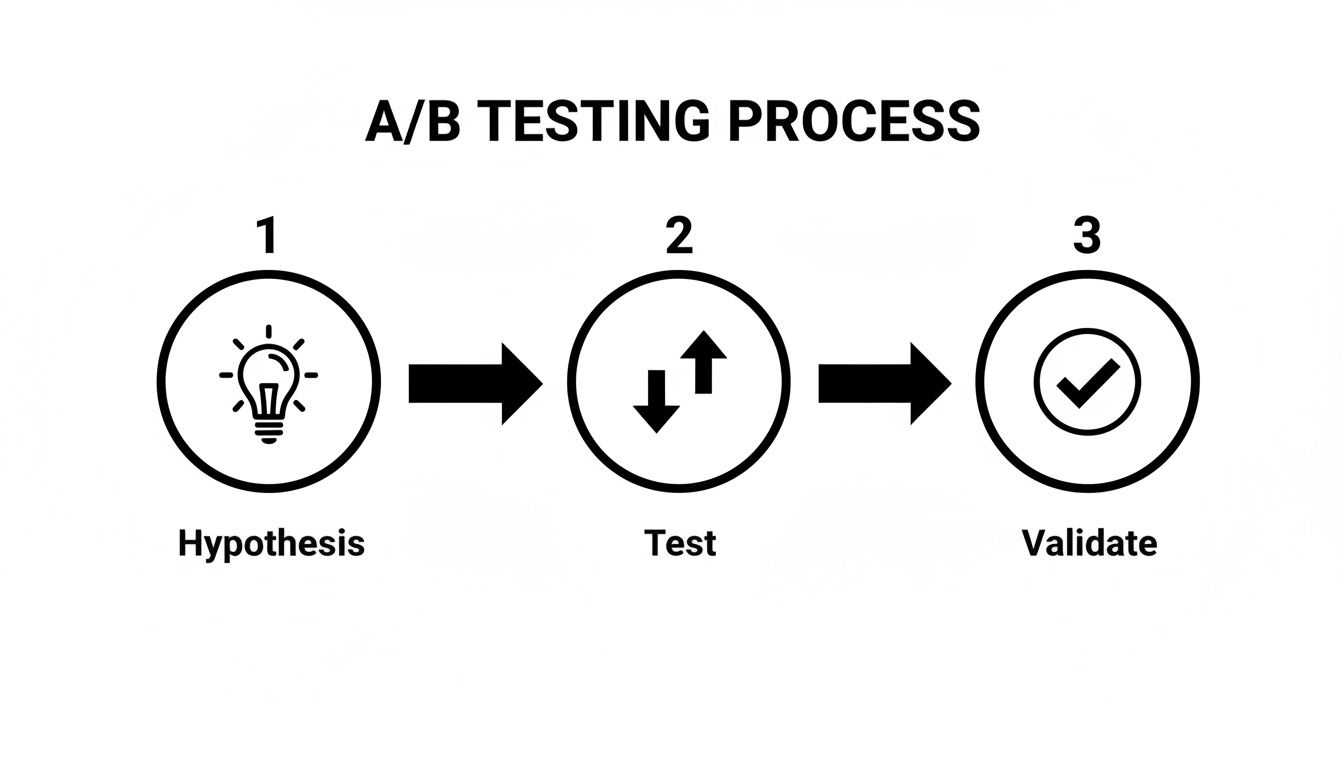
This simple process is what turns guesswork into a repeatable strategy for growth. You’re essentially applying the scientific method directly to your bottom line: form a hypothesis, test it against what you’re currently doing, and let the data tell you what won.
By starting with a high-impact area and committing to this cycle of improvement, you’ll begin the journey of transforming your website into your single most powerful tool for sustainable business growth.
Got Questions? We've Got Answers.
As you start digging into conversion rate optimization, you'll naturally run into some common questions. Moving from theory to actually getting things done always brings up a few tricky spots. Here are the answers to the questions we hear the most from teams trying to get their CRO efforts off the ground.
"So, What's a Good Conversion Rate, Anyway?"
This is the million-dollar question, and the honest-to-goodness answer is: it completely depends. Your industry, your price point, even where your traffic is coming from—it all changes the definition of "good."
Sure, you'll see stats floating around that the average website converts at 2-5%, but that number is so broad it's almost useless.
- An e-commerce store selling fun, low-cost gadgets might be ecstatic with a 4-5% conversion rate.
- But a B2B SaaS company selling a complex, high-ticket enterprise solution? They might see a 0.5% conversion rate on demo requests and call it a massive win.
Here's what really matters: your own current conversion rate. Forget the industry averages for a second. The whole point of CRO is to beat your own baseline, again and again. Turning your 1% conversion rate into a 1.5% rate is a 50% lift in leads or sales. That's the win.
"How Long Do We Need to Run This A/B Test?"
This is a critical one. Pull the plug too early, and you might celebrate a "win" that was just a random fluke. Let it run forever, and you're just wasting time on a test that’s going nowhere.
The sweet spot is hitting statistical significance. Most A/B testing platforms aim for a 95% confidence level, which is the industry standard. This just means you're 95% sure the results aren't a coincidence.
To get there, you need enough visitors and conversions to make a reliable call. For most sites, this takes at least two to four weeks. This timeframe also helps smooth out any weird traffic spikes or dips, like the difference between how people behave on a Tuesday versus a Saturday.
"How Can I Do CRO if I Have No Budget?"
You don't need a six-figure software budget to start making meaningful improvements. Some of the most powerful insights come from tools that are either free or have very generous free plans.
You just have to be scrappy and focus your efforts.
- Find the Leaks: Start with Google Analytics. It's free and it's powerful. Hunt for your high-traffic pages that also have a surprisingly high exit rate. That's your ground zero.
- See What's Broken: Grab a tool with a free plan like Hotjar or Lucky Orange. Install it on your most critical pages and just watch a few dozen session recordings. You'll be amazed at what you see people struggling with.
- Just Ask: This one's almost too simple. Add a simple, one-question survey on your confirmation or thank-you page. Ask, "What almost stopped you from completing your purchase today?" The answers will be pure gold.
Ready to turn your forms from a point of friction into your best conversion tool? Orbit AI uses conversational AI to engage, qualify, and convert your best leads in real time. Start building for free today.


