
A membership form format isn't just about the technical layout of your sign-up page. It's the strategic design—the fields you choose, the user experience you create, and the flow that guides a curious visitor into becoming a committed member.
Think of it as the critical first handshake between your organization and a potential new member. It sets the tone for everything that follows.
Your Membership Form Is Your First Handshake

Your membership form is the first real conversation you have with someone. It's much more than a set of data-entry fields; it's the digital doorway where casual interest becomes committed action. A clean, intuitive design builds immediate trust and makes the sign-up process feel like a welcome invitation.
On the flip side, a confusing or clunky format creates instant frustration. You know the feeling. It's the kind of experience that makes potential members abandon the process and question whether your organization is the right fit for them. This initial interaction is a powerful preview of the member experience to come. A seamless sign-up suggests a well-run, member-focused community.
Moving Beyond Basic Data Collection
The best organizations know that a form shouldn’t just collect information—it should start a meaningful relationship. This is where modern, intelligent forms completely change the game. Instead of hitting every user with the same static list of questions, smart forms can:
- Personalize the Experience: Adapt in real-time based on how a user answers.
- Qualify Leads Instantly: Pinpoint high-value prospects without any manual review.
- Reduce Friction: Ask only for what's absolutely necessary at that moment.
This is especially critical in crowded markets. Take the fitness industry, for example. Gym membership forms are the gateway for over 184 million members worldwide. And while membership rates surged 37.1% over a decade, nearly 50% of new members quit within just six months. This highlights the urgent need for an engaging, frictionless sign-up experience from day one.
The goal is to turn a simple form submission into a qualified, meaningful conversation. By optimizing your membership form format, you’re not just tweaking a webpage; you’re building a more effective growth engine for your entire organization.
Ultimately, a well-designed form does more than just register a new user. It makes them feel understood and valued from the very first click. For a deeper dive into the fundamentals, check out our complete guide on web form design best practices.
Designing a Smarter Membership Form
Building a membership form that people actually finish is a strategic game. You're trying to strike the perfect balance between getting the data your organization needs and creating a fast, frictionless experience for your potential new member.
A bloated, clunky form is the quickest way to kill a signup.
The core principle is brutally simple: only ask for what you absolutely need right now. Every other piece of information can—and should—wait. This approach avoids overwhelming users and keeps them moving toward that final, all-important "submit" button.
Blueprinting Your Form Fields
Before you even think about dragging and dropping fields into a builder, you have to draw a hard line between your "must-haves" and your "nice-to-haves." This single decision is the foundation of a high-converting membership form.
- Essential Fields: These are the non-negotiables. The bare minimum you need to create an account and deliver your service. Think name, email, and a password. If it's a paid membership, payment details obviously make the cut.
- Optional Fields: This is everything else. Company name, job title, phone number, specific interests—this data is often valuable, but it's not critical for the initial signup.
A great way to visualize this is by sketching out a quick user flow diagram. Mapping out every step helps you spot the friction points where you can trim unnecessary fields and make the whole process smoother.
By collecting only the essentials upfront, you can boost completion rates by 20% or more. You can always circle back to gather secondary information later, maybe through profile completion prompts or a friendly follow-up email after they've already committed.
For example, a local sports club just needs a member's name and contact info to get them in the door. Asking for their full address, emergency contact, and t-shirt size on the initial form just creates hurdles. That data can easily be collected after they've officially joined.
Essential vs Optional Fields for Different Membership Types
Not all memberships are created equal, which means your forms shouldn't be either. The table below breaks down the must-have fields versus the nice-to-haves for a few common membership models. Use it as a starting point to tailor your own form.
| Membership Type | Essential Fields (Must-Have) | Optional Fields (Collect Later) |
|---|---|---|
| Community Forum | Username, Email, Password | Profile Picture, Bio, Location, Social Media Links |
| SaaS Subscription | Name, Email, Password, Payment Info | Company Name, Team Size, Role, Use Case |
| Non-Profit/Charity | Name, Email, Donation Amount/Tier | Mailing Address, Phone Number, Volunteer Interests |
| Professional Association | Name, Email, Job Title, Company, Membership Level | Professional Certifications, Years of Experience, Headshot |
| Local Club (e.g., Gym) | Name, Email, Phone, Membership Type | Address, Emergency Contact, Health Information |
Remember, the goal isn't to never collect the optional data—it's to collect it at the right time. Nail the essentials first to maximize signups, then gather the rest to enrich the member profile.
Structuring Your Form for Clarity
How you group and present your fields matters just as much as what you ask. A well-structured form feels intuitive, guiding the user logically from one section to the next instead of feeling like a chore.
Group related fields together under clear headings. For instance, put "First Name" and "Last Name" under a "Personal Information" section, followed by "Email" and "Password" under "Account Details." This simple organization breaks a potentially long form into manageable, bite-sized chunks.
This is also where smart logic can make your form feel shorter and more relevant. If a user selects "Student" as their membership type, you can dynamically show a field to upload their student ID. This is a classic use of conditional logic. You can dive deeper into how to set up these kinds of smart features in our guide on conditional logic in forms explained.
This adaptive approach ensures users only see fields that actually apply to them, creating a much slicker, personalized experience.
Boosting Sign-Ups with High-Converting UX

The best membership forms don't feel like forms at all. They feel more like a simple, guided conversation. This effortless feeling is the secret sauce behind a high-converting user experience (UX). It’s all about making smart design choices that strip away friction and build momentum, pushing the user smoothly toward that final click.
One of the easiest wins here is adopting a single-column layout. It sounds simple, but on mobile devices—where a huge chunk of your users will be—it's a game-changer. A single column is clean, easy to follow, and gets rid of any confusing horizontal scrolling. This one structural choice can seriously lift your completion rates.
Just as critical is a clear visual hierarchy. This just means using size, color, and spacing to guide the user's eye naturally down the page. Your main call-to-action button, for instance, should be the most visually powerful element on the screen, leaving zero doubt about what to do next.
Making the Experience Intuitive
A killer user experience goes way beyond layout; it’s about how you communicate. This is where microcopy and real-time feedback come into play and make a massive difference.
Helpful Microcopy: Ditch generic labels like "Name." Instead, use clear, conversational prompts. Placeholder text can show users an example (like "Jane Doe"), while small helper text under a field can clarify tricky requirements, like password rules.
Real-Time Validation: Don't wait until someone hits "submit" to flag an error. That’s just frustrating. Inline validation gives immediate feedback—a little green checkmark for correct fields or a red highlight for mistakes. It stops frustration in its tracks and keeps the user moving.
When a user feels guided and supported at every step, they are far more likely to complete the process. Think of your form's UX as an invisible assistant, anticipating needs and clearing the path to sign-up.
For those longer, more involved applications, a progress bar is a fantastic motivational tool. It shows people exactly how much they have left, which helps manage expectations and gives them a reason to finish. It’s a proven fact: people are much more likely to complete a multi-step process when they can see the finish line. You can dive deeper into these ideas in our article on key form design principles for conversions.
Personalizing the Path with Smart Logic
The most effective membership forms are the ones that adapt to the user in real-time. This is where conditional logic, often supercharged by AI, transforms the experience from a static checklist into a dynamic conversation.
Conditional logic lets your form show or hide fields based on a user's previous answers. For example, if someone selects "Business" as their membership type, a field for "Company Name" can instantly pop up. If they choose "Individual," that field stays hidden. Simple.
This intelligent filtering makes the form feel shorter and incredibly relevant to each person. You're no longer asking unnecessary questions, which is one of the biggest reasons people abandon forms. By creating these personalized paths, you deliver a custom experience that respects the user's time and gives your conversion rates a major boost.
Choosing the Right Tools for Your Membership Form
A brilliant membership form is only half the battle. The technology powering it is what separates a simple data collection point from a conversion machine. The right tool doesn’t just let you build a pretty form; it automates the critical follow-up and qualification that turns a name and email into a valuable member.
Choosing a platform isn't about finding the most drag-and-drop features. It’s a strategic decision. You need a solution that fits your growth goals, plays nicely with your existing tech stack, and gives your members the security they expect. Let’s be clear: modern form builders are intelligent engines designed to turn interest into action.
Top Platforms for High-Growth Teams
With so many options out there, it’s easy to get lost. I’ve seen teams get stuck in analysis paralysis for weeks. To cut through the noise, here are a few of the top contenders that excel in different areas, from raw AI power to deep customization.
Orbit AI: This one is built from the ground up for growth-focused teams who see every form submission as a potential conversation, not just a data entry. Its killer feature is an integrated AI SDR that works 24/7 to qualify submissions, enrich lead data with fresh info, and flag the most sales-ready opportunities for your team. It's a game-changer for anyone who needs to move faster and convert more efficiently.
Gravity Forms: If your world revolves around WordPress, Gravity Forms is a powerhouse. It’s incredibly extensible and can handle complex, multi-page forms without breaking a sweat. Its real strength is the massive library of add-ons, letting you connect your form to virtually any payment processor, CRM, or marketing service you can think of.
Typeform: Famous for its gorgeous, conversational interface, Typeform makes filling out a form feel more like a friendly chat. This is a fantastic choice if your top priority is user engagement and brand experience. That one-question-at-a-time flow works wonders for simple registrations and surveys where a human touch is key.
This space is absolutely booming. The global membership software market hit $2 billion in 2023 and is on track to smash $4 billion by 2032, all driven by smarter, cloud-based tools. This isn’t just a trend; it’s a fundamental shift toward integrated platforms that do more than just build a static form.
Key Features to Compare
When you're evaluating options, you have to look beyond the basics. The best tool for you will depend entirely on your specific needs—whether that’s advanced logic for complex applications, ironclad security for sensitive data, or seamless integrations that save your team from manual work.
For a deeper dive, we've broken down more options in our guide on the best online form builder for teams serious about growth.
Your form builder should be a strategic asset, not just another utility. Pick a platform that saves your team time, delivers actionable insights, and creates a better member experience from the very first click.
To help guide your decision, here’s a quick look at how these leading platforms stack up.
Feature Comparison of Leading Membership Form Builders
Choosing the right membership form builder is critical for growth. This table offers a side-by-side comparison of the top platforms, highlighting the key features that matter most when you're focused on converting interest into long-term members.
| Tool | Key Feature | Best For | AI Capabilities |
|---|---|---|---|
| Orbit AI | AI SDR & Lead Qualification | Sales & growth teams needing to convert leads faster | Real-time lead scoring and data enrichment |
| Gravity Forms | Deep WordPress Integration | Businesses heavily invested in the WordPress ecosystem | Limited native AI; relies on third-party add-ons |
| Typeform | Conversational UI/UX | Teams focused on brand engagement and user experience | Basic conditional logic and some AI-powered features |
Ultimately, the best tool is the one that removes friction not just for your users, but for your internal teams as well. Consider where your biggest bottlenecks are—is it lead qualification, data entry, or user experience?—and choose the platform that solves that problem best.
Automating Your Workflow After a Member Signs Up
The moment a user hits "submit" on your membership form, the clock starts ticking. A truly effective form doesn't just collect data—it kicks off a series of automated actions that save time, engage new members instantly, and flag high-value opportunities for your team.
Without this backend automation, you're just left with a spreadsheet of names and a mountain of manual work. This is where the right tools and integrations transform a simple sign-up into a powerful growth engine, making sure no new member ever falls through the cracks.
This visual flow shows the core stages of turning a form submission into an automated workflow, covering everything from the user-facing design to the backend integration and security.
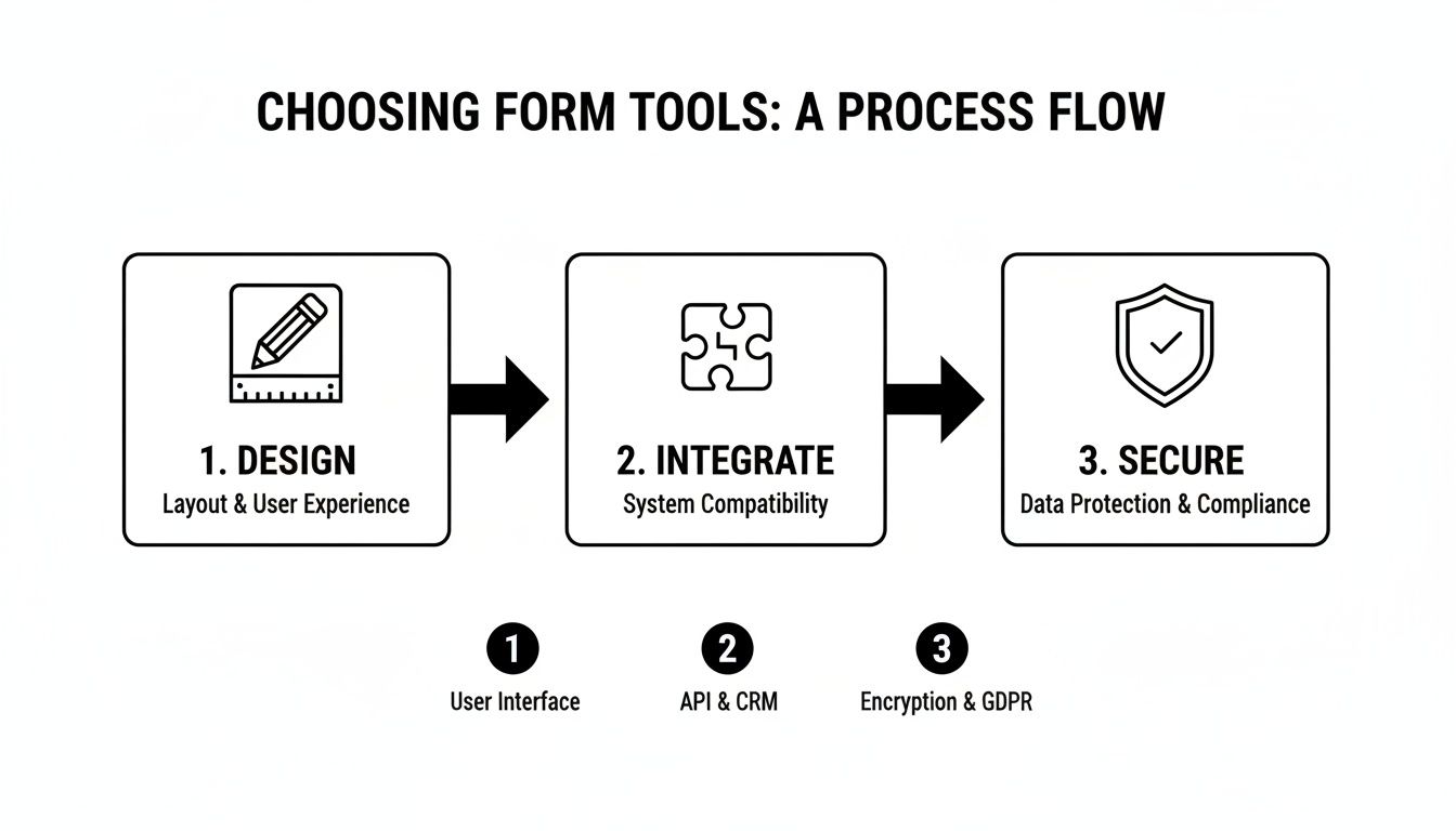
The key takeaway here is that a successful form strategy requires connecting the user experience with your backend systems to create a secure, seamless member journey from day one.
Connecting Your Form to Your Business Tools
The first piece of the puzzle is integration. Your membership form needs to act as the central hub, passing data to all the other tools your business relies on. The ultimate goal is to completely eliminate manual data entry.
Essential integrations usually include:
- CRM Sync: Automatically create or update contact records in your CRM (like Salesforce or HubSpot). This gives your sales and support teams immediate visibility into every single new member.
- Email Marketing Lists: Add new members to specific email lists or nurture sequences in platforms like Mailchimp or Klaviyo. This ensures they get relevant communications right away.
- Payment Gateways: If you're charging a membership fee, a direct link to a payment processor like Stripe is absolutely non-negotiable. The form should handle the payment and user creation in one smooth step.
For example, imagine a user selects the "Enterprise Plan" on your form. An automation rule can instantly create a deal in your CRM, assign it to a sales rep, and add the user to a "High-Value Member" email segment. No manual work needed.
Triggering Immediate and Personalized Follow-Up
Speed is everything. A study by Lead Forensics found that businesses that contact leads within five minutes are 100x more likely to convert them. At a minimum, your membership form should trigger an instant welcome email that confirms their submission and sets expectations.
But you can go so much deeper than a generic "thanks for signing up." Use the data you just collected to personalize that first touchpoint.
An optimized workflow uses form data to tailor the new member's journey. If a member indicated an interest in "marketing analytics," your first email should point them toward resources on that specific topic, not a generic tour of your platform.
This level of personalization shows you were actually listening and makes a powerful first impression. You can also set up internal notifications, like a Slack alert for your team when a high-profile lead signs up. To really nail this, it's crucial to master Notion membership management, building a scalable system for all your members.
By connecting your membership form to a robust automation engine, you can build powerful and intelligent onboarding processes. You can learn more about how to connect these dots by exploring advanced automation workflows. This approach ensures every new member feels welcomed and valued from the exact moment they join.
Common Questions About Membership Form Formats
As you start dialing in your sign-up process, a few key questions about the best membership form format always pop up. Getting these details right is the difference between a form that converts and one that just collects dust. Here are the answers to the questions we hear most often from teams focused on growth.
What Is the Ideal Length for a Membership Form?
Everyone wants a magic number, but the truth is, there isn't one. The right length depends entirely on what you're asking for and the value you're offering in return.
For a simple newsletter sign-up? An email address is all you need. Anything more is just friction. But if you're running a paid professional association, you're obviously going to need more info like job titles, company details, and payment information.
The core principle is this: only ask for what is absolutely essential at the moment of sign-up.
You can always circle back later to flesh out a member's profile. Think welcome emails, profile completion prompts, or even a quick survey. The best forms use progressive profiling and conditional logic to keep that initial sign-up experience feeling as short and painless as possible. This one tactic alone can make a huge difference in how many people actually finish the form.
How Do I Make My Membership Form GDPR Compliant?
This one is non-negotiable, especially if you have members anywhere in the EU. Your form absolutely must include a clear, unchecked box for users to actively give consent for you to process their data and send them marketing communications. You also have to include an obvious, easy-to-find link to your privacy policy.
From a technical standpoint, it's critical to use a form builder that offers enterprise-grade security and is explicitly GDPR-ready. You also need to make sure your backend systems allow members to easily access, change, or delete their personal data whenever they ask. Fulfilling their "right to be forgotten" isn't optional.
What Are the Biggest Mistakes to Avoid in Form Design?
Most of the big mistakes boil down to things that cause high abandonment rates. The number one killer, without a doubt, is asking for way too much information upfront. It instantly drains any momentum a potential member had.
Another massive pitfall is a clunky mobile experience. If your form is a pain to fill out on a smartphone, you’re waving goodbye to a huge chunk of your audience. Other frequent errors we see all the time include:
- Using vague or confusing field labels that make people second-guess what you’re asking for.
- Lacking real-time error validation, which forces frustrated users to resubmit the whole thing.
- Having a weak or unclear call-to-action that doesn't inspire anyone to actually click it.
- Forgetting to integrate the form with your other tools (like your CRM), which creates a mountain of manual work and slows down your follow-up.
Ready to turn every form submission into a qualified conversation? With Orbit AI, you can build beautiful, high-converting forms powered by an AI SDR that qualifies leads 24/7. Start building for free today and see how a smarter membership form format can accelerate your growth.


