
You've paid for the click, matched the headline to the ad, and built a page that answers the buyer's main question. Then a qualified visitor reaches the form, sees a long list of required fields, and leaves. The campaign looks healthy in the dashboard, but the form stealthily turns expensive attention into lost pipeline.
Landing page form design is a revenue decision, not a finishing touch. The right structure reduces friction without stripping away the information sales needs, and it gives every visitor a path that matches their intent.
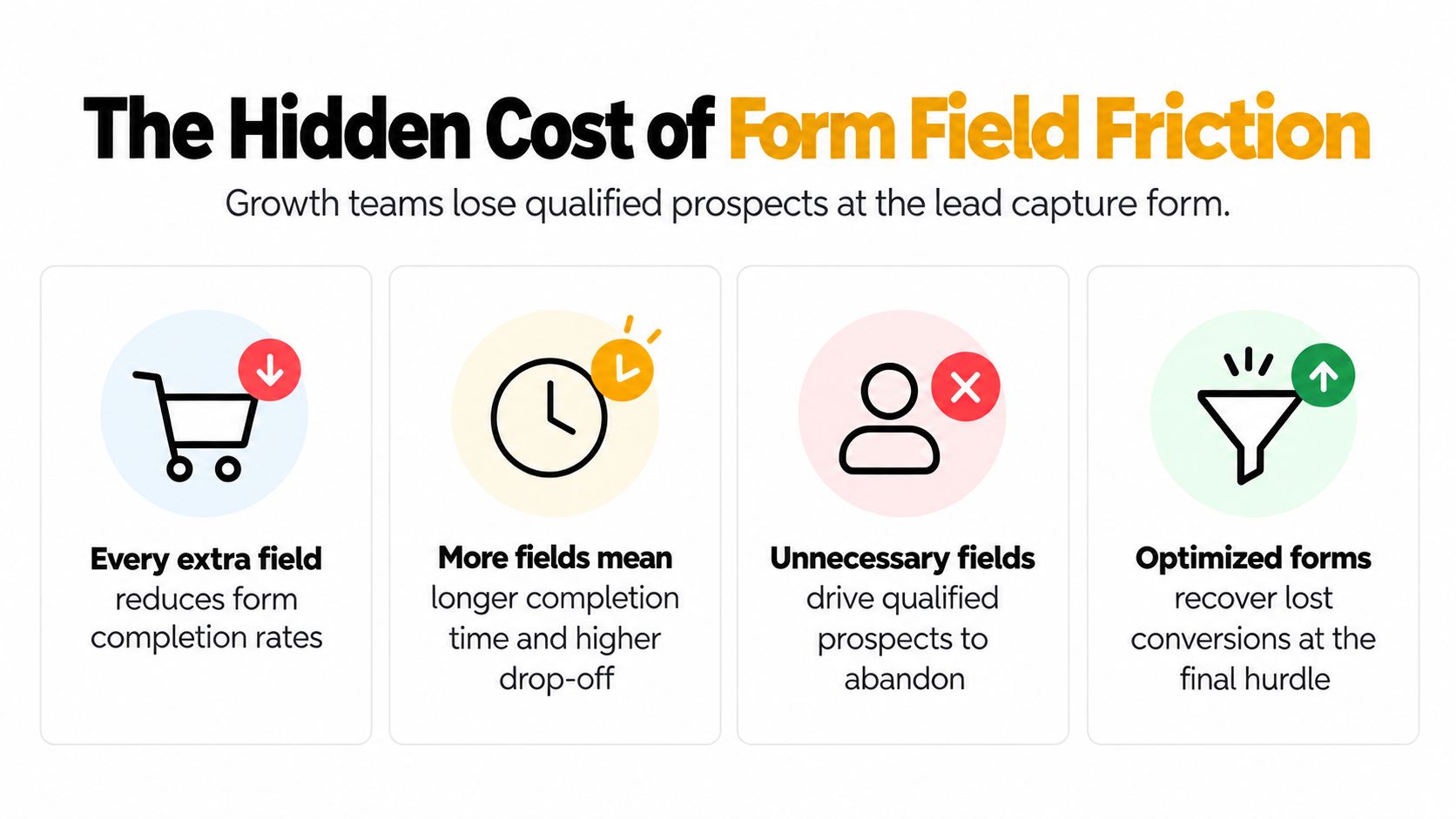
The Hidden Cost of Form Field Friction
A visitor who's ready to request a demo usually doesn't abandon because they lack interest. They abandon because the next step suddenly feels disproportionate to the value being offered. A form asking for an email and a clear business need feels lightweight. A form asking for job title, company size, phone number, budget, industry, and several open-ended answers feels like an intake process.
That distinction matters because forms operate as a psychological exchange. The visitor gives information in return for a resource, conversation, quote, or trial. Each additional question increases the perceived cost, especially when the visitor can't see why the business needs the answer.
Field count creates a measurable tax
The historical pattern is consistent: completion falls as forms become more complex. In a 2026 benchmark set, consumer forms with three fields convert at about 25%, four fields at 20%, and five fields at 15%. The same benchmark reports 11.4% for seven fields and 6.9% for ten or more fields, as summarized by Ivy Forms' analysis of form fields and completion rates.
A separate 2026 benchmark reports a cross-industry median form conversion rate of 17.3%, with newsletter signups reaching 32.1% while ten-field demo requests fall to 6.9% in the cited dataset. That contrast shows why a single “average conversion rate” can mislead a growth team. The offer, audience, and field burden all change the baseline.
The broader field-count curve is equally direct. Median completion rates are reported at 31.9% for one-field forms, 23.1% for three fields, 17.0% for five fields, 11.4% for seven fields, 8.1% for nine fields, and 6.9% for ten or more fields in Digital Applied's 2026 benchmark.
Practical rule: Treat every field as a friction cost that must justify its place in the qualification process.
Shorter doesn't mean weaker
The old model asked marketing to collect everything upfront. The stronger model asks for the information needed for the current interaction, then gathers more context as intent develops. That's the logic behind progressive profiling, conditional questions, and multi-step forms.
Reducing a form from 11 fields to 4 is associated with an average 120% increase in conversions in summaries cited by Contentmation's form-field research. The same source reports a conversion pattern of 13.4% for single-field email forms, 10.1% for three fields, 7.8% for five fields, 5.3% for seven fields, and 3.6% for nine fields in one 2026 dataset.
That doesn't mean every B2B form should ask only for an email. A high-intent demo request may justify more qualification than a downloadable checklist. The mistake is charging every visitor the same data price, regardless of where they are in the buying journey.
For a detailed look at the fields that create unnecessary resistance, see how form fields cause user friction. The practical takeaway is simple: optimize the exchange, not just the form's appearance.
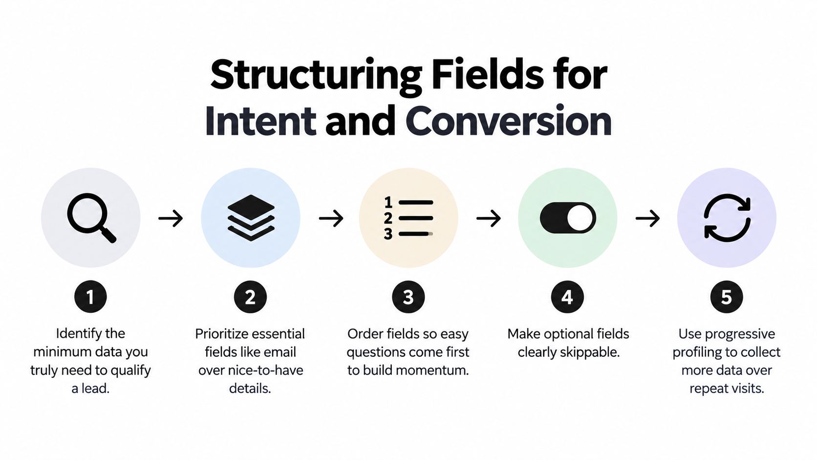
Structuring Fields for Intent and Conversion
Field reduction is the starting point, not the strategy. The question is which information deserves to appear first, and which questions can wait until the visitor has demonstrated stronger intent.
A top-of-funnel visitor downloading a checklist has made a low-commitment decision. A buyer requesting a technical evaluation has made a much stronger one. Giving both people the same form forces the first visitor through unnecessary friction and gives the second too little room for useful qualification.
Match the sequence to intent
For low-intent capture, lead with the smallest credible exchange:
- Start with contactability. Ask for email when the goal is delivering a resource or starting a nurture sequence.
- Add identity only when useful. First name can support personalization, but it shouldn't be mandatory if the offer doesn't require it.
- Delay qualification. Company, role, use case, and timeline can be collected later through email engagement, a follow-up interaction, or a sales conversation.
For a demo or consultation, sequence the form around momentum:
- Open with easy questions. An email address or company name creates a low-effort first action.
- Ask the core qualification question next. Use a structured use-case or challenge field rather than an essay box.
- Collect routing information. Role, company size, region, or implementation needs can help sales prioritize the request.
- Reserve sensitive questions for later. Budget and phone number often feel more invasive, so ask only when the value of the conversation supports it.
The form field order optimization guide applies the same principle to the interaction itself: questions should feel like a natural progression, not an interrogation.
Reduce cognitive load in the layout
A vertical, single-column layout keeps the eye moving in one direction and works well across screen sizes. Nielsen Norman Group recommends short forms, single-column layouts, clear labels, correctly sized fields, and no reset buttons. Placeholder text shouldn't carry the label because it disappears when the visitor begins typing.
Use smart defaults when the answer can be inferred safely. A country selector based on location, a preselected campaign value, or a known account detail can reduce typing, but defaults must remain easy to change. Never hide an assumption that could produce an incorrect lead record.
Group related controls with semantic structure. The U.S. Web Design System form guidance recommends preserving HTML order, using a fieldset with one legend for related controls, keeping layouts vertical, and marking required fields with a red asterisk and the required attribute. These choices support both scanning visitors and assistive technology.
A useful form is selective, not merely short. Every field should either enable delivery, improve routing, or support a specific sales decision. If nobody acts on the answer, remove it from the first interaction.
Mastering Microcopy and Progressive Profiling
Longer qualification doesn't always fail because of the number of fields. It often fails because the form makes the work feel unexplained. A label such as “Company” is functional. “Where should we send your team's workspace?” creates context and tells the visitor why the question belongs in the exchange.
Microcopy reduces uncertainty at the exact moment a visitor decides whether to continue. It can explain a format, set expectations, address privacy concerns, and make a multi-step interaction feel coherent without adding visual clutter.

Ask for more without making the form feel larger
A strong progressive profile starts with a useful first conversion and earns the next question. An email-only resource form might later ask about role after the visitor clicks a product email. A product-led signup could ask about team size after the user explores a workspace feature. The data becomes more valuable because the visitor has supplied it in a relevant context.
Use conditional logic to avoid irrelevant questions. If someone selects “evaluating for a team,” show a team-size question. If they select “researching options,” ask about the problem they're investigating instead of requesting a sales timeline.
The welcome screen should establish value before asking for effort. Keep the opening promise specific: what the visitor receives, how long the interaction takes, and what happens after submission. Research from Typeform on lead-capture forms associates six or fewer questions with the highest completion rates, and forms completed in under one minute with a 15 percentage-point higher completion rate than longer forms. The same research associates asking for email first with a 9-point lift, while a question on the welcome screen corresponds with a 5-point reduction and URL parameters on that screen with a 16-point increase.
Write labels that prevent hesitation
Useful microcopy is concrete:
- Format guidance: “Use your work email so we can route your request to the right team.”
- Privacy reassurance: “We'll use this address to send the report and relevant product updates. Unsubscribe anytime.”
- Transition copy: “One last detail helps us tailor the walkthrough.”
- Error recovery: “Enter a valid work email, such as name@company.com.”
Avoid coy or manipulative language. A playful button can work for a consumer offer, but B2B visitors usually benefit from clarity about the next action, such as “Request a technical review” or “Send me the benchmark.”
A multi-step form should also show progress transparently. Don't label the first screen “Step 1 of 2” if the second screen branches into several more questions. The goal isn't to disguise effort. It's to divide a meaningful process into manageable decisions.
The progressive profiling guide provides a useful way to map questions across repeat interactions instead of forcing every answer into the first session.
The best sequence preserves momentum while improving the information sales receives. Marketing gets a cleaner first conversion, and sales gets richer context when the buyer has shown that the context is worth providing.
Designing for Accessibility and Error Prevention
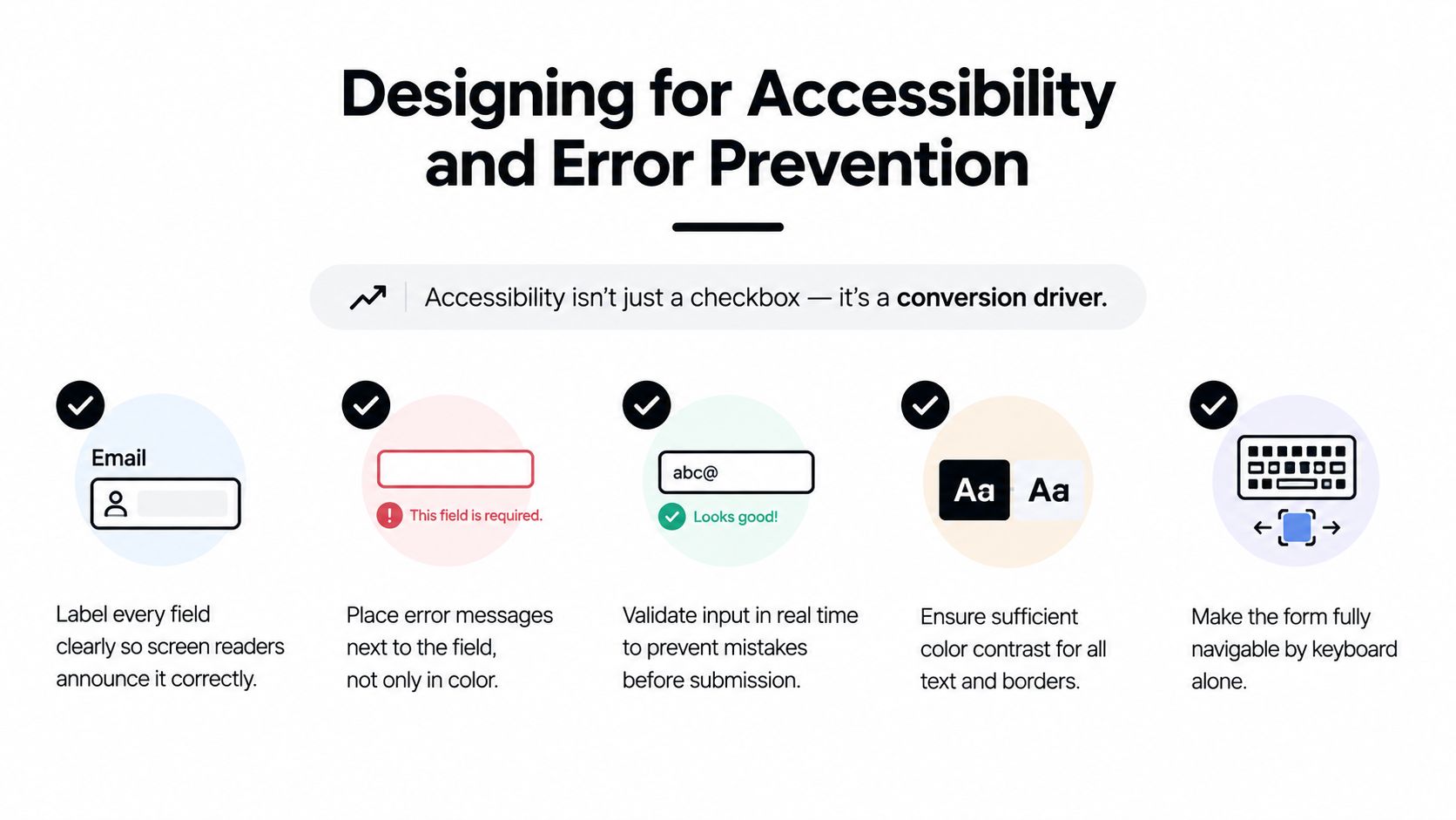
Accessibility is often treated as a compliance task that sits outside conversion optimization. That's a costly separation. A form that supports keyboard navigation, clear labels, readable contrast, and recoverable errors gives more people a fair chance to complete the action, and it produces cleaner submissions for the team receiving them.
Human Standards reports 78% one-try submissions for compliant forms compared with 42% for forms that violate basic guidelines. The difference makes accessibility a completion-quality issue, not just a legal or reputational concern, as documented in its form interaction patterns guidance.
Prevent errors before submission
Real-time validation works best when it confirms an answer without interrupting the user's flow. Validate an email after the visitor leaves the field, identify a missing required value near the relevant control, and explain how to fix the problem in plain language.
The University of Washington's UX guidance for forms recommends smart defaults, requesting only needed information, and validating in real time or on blur when possible. Real-time validation matters especially on mobile, where correcting a page-level error can require scrolling, locating the field, reopening the keyboard, and reconstructing what went wrong.
Input controls should match the answer. Use an email input for email, a telephone input for phone numbers, and constrained choices when the set of answers is known. Dropdowns can reduce open-ended typing, although they become cumbersome when the list is long. Radio buttons or segmented choices often make a short set of options easier to scan.
Make recovery obvious
Color alone shouldn't communicate an error. Pair a visible message with an icon, descriptive text, and a programmatic relationship between the message and its field. Don't erase valid answers when one field fails, and don't move the user unexpectedly after validation.
Avoid reset and clear buttons unless the use case requires them. Accidental resets destroy work and create a needless abandonment event. A clear submit label, visible required-field treatment, and a logical tab order are more valuable than decorative controls.
Teams should also review meeting WCAG standards as part of the design and QA process. Test with a keyboard, a screen reader, zoom, narrow mobile widths, and different input methods before trusting a form with paid traffic.
Good error prevention improves pipeline quality in a practical way. Visitors who submit successfully on the first attempt are less likely to enter partial information, duplicate records, or abandon a request that sales would have considered valuable.
Top Form Builders for Modern Growth Teams
The platform underneath a form determines how quickly a team can test sequencing, connect submissions to revenue systems, and adapt the experience for different audiences. A builder that looks polished but exports leads manually creates operational friction. A platform with deep integrations but rigid interaction patterns forces marketing to choose between data flow and user experience.
The right comparison should focus on four questions: can the team build without engineering support, can the form branch by intent, can the system qualify submissions, and can it send reliable context into the existing stack?
Form Builder Feature Comparison
| Platform | AI Lead Qualification | Visual Builder | Native Integrations |
|---|---|---|---|
| Orbit AI | Built-in AI SDR for qualification, enrichment, and lead scoring | Visual builder with branded forms, conditional logic, branching, and standard or conversational flows | Connects with CRMs, marketing automation, and data platforms |
| Typeform | Qualification depends on configured questions and connected workflows | Conversational, multi-step form experiences with customizable layouts | Integrations available through native connections and automation tools |
| Jotform | Qualification is typically configured through rules, fields, and connected workflows | Drag-and-drop builder with templates and embeddable forms | Connects forms with tables and external business tools |
| Unbounce | Lead qualification generally depends on the form setup and downstream systems | Landing page builder with conversion-focused page controls | Integrates with marketing and lead-management systems |
| HubSpot Forms | Uses CRM properties, workflows, and broader HubSpot automation for routing | Form editor integrated with HubSpot landing pages and CRM records | Native connection to HubSpot CRM, marketing, and sales features |
Orbit AI fits teams that want a visual landing page form builder alongside built-in qualification, real-time analytics, collaborative access, and connections to more than 50 tools across CRM, marketing automation, and data workflows. Its AI SDR can enrich submissions, score leads, and surface sales-ready opportunities, while conditional logic supports different paths for different buyer responses.
Typeform remains useful when the interaction itself should feel conversational and highly guided. Jotform is practical for teams that value templates, drag-and-drop construction, and broad form use cases. Unbounce makes sense when the form is one part of a larger campaign landing page, while HubSpot Forms is a natural choice for teams already committed to HubSpot's CRM and automation layer.
No builder removes the need for judgment. Before choosing, map the required fields, routing rules, enrichment needs, analytics events, security requirements, and handoff to sales. A fast visual editor matters, but so does the team's ability to see whether a conversion became a qualified opportunity.
Measuring and Optimizing Form Performance
Submission volume is an incomplete success metric. A shorter form may increase conversions while reducing the information sales needs, and a longer form may lower completion while improving qualification. The scorecard has to connect visitor behavior with downstream pipeline quality.
Start with an event model that records the interaction, not only the final submission. Track form view, first interaction, each field focus, validation error, step completion, abandonment, submission, routing outcome, and qualified-opportunity status where your systems support it.
Diagnose the friction by field
A field-level report should answer:
- Where do visitors stop? Compare starts with progression to each field or step.
- Which questions trigger errors? Separate invalid input from hesitation and from technical failures.
- Who experiences the issue? Break results down by device, browser, landing page, campaign, audience, and geography.
- What happens after submission? Connect form records to accepted leads, meetings, opportunities, and revenue stages.
Field-level analysis turns “the form underperforms” into a testable hypothesis. If mobile visitors reach the phone field but rarely complete it, test input behavior and whether the number is genuinely necessary. If a budget question produces errors or abandonment across channels, test a structured range or move the question later.
Test one meaningful change
A/B tests should isolate decisions such as:
- Length: remove a field or defer it to a later interaction.
- Sequence: ask email first, then move qualification after the initial commitment.
- Control type: compare free text with radio buttons, structured choices, or an autocomplete field.
- Microcopy: clarify privacy, delivery, timing, or formatting.
- Flow: compare a single-page form with a carefully designed multi-step path.
Use conversion rate as the immediate signal, but judge the winner against sales acceptance and pipeline progression. The form analytics and tracking guide is useful for building that measurement layer.
A reliable optimization loop is simple: establish the current path, find the highest-friction interaction, form one hypothesis, test one change, and review both completion and lead quality. The best landing page form design doesn't maximize submissions at any cost. It creates a clear exchange for the visitor and a useful, actionable record for the team that follows up.
Orbit AI gives growth teams a visual form builder, conditional flows, AI-powered lead qualification, real-time analytics, and integrations that move context into sales and marketing workflows. Build a lower-friction landing page form, monitor where visitors drop off, and turn the strongest submissions into qualified conversations with Orbit AI.